扩展前一篇“上中下三栏布局”,中间栏划分成两列,一列宽度固定,一列宽度随浏览器窗口宽度的变化而变化。固定宽度列定义为#side,可分为左侧布局和右侧布局,分别实现如下:
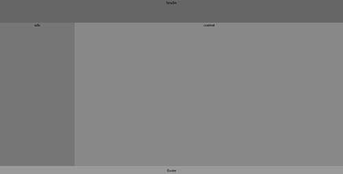
1-2-1左侧固定宽度布局
<!DOCTYPE html PUBLIC "-//W3C//DTD XHTML 1.0 Transitional//EN" "http://www.w3.org/TR/xhtml1/DTD/xhtml1-transitional.dtd">
<html xmlns="http://www.w3.org/1999/xhtml">
<head>
<meta http-equiv="Content-Type" content="text/html; charset=utf-8" />
<title>1-2-1左侧固定宽度布局</title>
<style type="text/css">
html, body, .container {margin:0;padding:0;height: 100%;text-align:center;}
body > .container {height: auto; min-height: 100%;}
#main {height: 100%;padding-bottom: 35px;}  /* 必须使用和footer相同的高度 */
.clearfix:after{content:".";display:block;height:0;clear:both;visibility:hidden;font-size: 0;}
.clearfix{display:inline-block}
/* Hides from IE-mac \*/
* html .clearfix { height: 1%;}
.clearfix {display: block;}
#contentWrap {float: left;width: 100%;height:100%;}
#content {margin-left: 300px;}
#side{float:left;margin-left:-100%;height:100%;position:relative;width: 300px;}
#footer{height: 35px;line-height: 35px;text-align: center;position:relative; margin-top: -35px;clear:both;}
#header{height:90px;background-color:#666666;}
#content{background-color:#888888;}
#side{background-color:#777777;}
#footer{background-color:#999999;}
</style>
</head>
<body>
	<div class="container">
	    <!-- 头部 -->
            <div id="header">header</div>
            <div id="main" class="clearfix">
                <div id="contentWrap">
			<div id="content">content</div>
	        </div>
		<div id="side">side</div>
	    </div>
	</div>
	<!-- 底部 -->
	<div id="footer">footer</div>
</body>
</html>
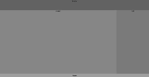
1-2-1右侧固定宽度布局
<!DOCTYPE html PUBLIC "-//W3C//DTD XHTML 1.0 Transitional//EN" "http://www.w3.org/TR/xhtml1/DTD/xhtml1-transitional.dtd">
<html xmlns="http://www.w3.org/1999/xhtml">
<head>
<meta http-equiv="Content-Type" content="text/html; charset=utf-8" />
<title>1-2-1右侧固定宽度布局</title>
<style type="text/css">
html, body, .container {margin:0;padding:0;height: 100%;text-align:center;}
body > .container {height: auto; min-height: 100%;}
#main {height: 100%;padding-bottom: 35px;}  /* 必须使用和footer相同的高度 */
.clearfix:after{content:".";display:block;height:0;clear:both;visibility:hidden;font-size: 0;}
.clearfix{display:inline-block}
/* Hides from IE-mac \*/
* html .clearfix { height: 1%;}
.clearfix {display: block;}
#contentWrap {margin-left: -300px;float: left;width: 100%;}
#content {margin-left: 300px;}
#side {float: right;width: 300px;}
#footer{height: 35px;line-height: 35px;text-align: center;position:relative; margin-top: -35px;clear:both;}
#header{height:90px;background-color:#666666;}
#content{background-color:#888888;}
#side{background-color:#777777;}
#footer{background-color:#999999;}
</style>
</head>
<body>
	<div class="container">
            <!-- 头部 -->
            <div id="header">header</div>
            <div id="main" class="clearfix">
                <div id="contentWrap">
		    <div id="content">content</div>
		</div>
		<div id="side">side</div>
	    </div>
	</div>
	<!-- 底部 -->
	<div id="footer">footer</div>
</body>
</html>
常见UI布局之1-2-1单列变宽布局,布布扣,bubuko.com
原文:http://www.cnblogs.com/omilan/p/3591223.html