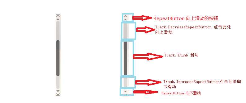
Wpf的ScrollBar可以分为六个区域:A.背景、B.向上按钮、C.向下的按钮、D.Track里面向上的按钮、E.Track里面向下的按钮、F.Track的Thumb
详情见下图
下面通过一个例子来自定义ScrollBar的样式

<Style x:Key="ScrollBar_style" TargetType="ScrollBar">
            <Setter Property="Template">
                <Setter.Value>
                    <ControlTemplate TargetType="ScrollBar">
                        <Grid Width="15">
                            <Border Width="13" HorizontalAlignment="Center" CornerRadius="5" Background="#33555555">
                            </Border>
                            <Track HorizontalAlignment="Center" Name="PART_Track" Width="{TemplateBinding Width}" Maximum="{TemplateBinding Maximum}" Minimum="{TemplateBinding Minimum}"
                                    Value="{TemplateBinding Value}"  IsDirectionReversed="true">
                                    <Track.DecreaseRepeatButton>
                                        <RepeatButton Template="{StaticResource scroll_background}" Command="ScrollBar.LineUpCommand"  />
                                    </Track.DecreaseRepeatButton>
                                    <Track.IncreaseRepeatButton>
                                        <RepeatButton Template="{StaticResource scroll_background}" Command="ScrollBar.LineDownCommand" />
                                    </Track.IncreaseRepeatButton>
                                    <Track.Thumb>
                                        <Thumb Style="{StaticResource scroll_thumb_style}" >
                                         </Thumb>
                                    </Track.Thumb>
                          </Track>

                        </Grid>

                    </ControlTemplate>
                </Setter.Value>
            </Setter>
        </Style>
这里用到了两个其它的样式,其中 scroll_background 定义Track.DecreaseRepeatButton 、 Track.IncreaseRepeatButton的背景
<ControlTemplate x:Key="scroll_background" TargetType="RepeatButton">
            <Border Background="Transparent">
            </Border>
        </ControlTemplate>
scroll_thumb_style定义Thumb的外观
<Style x:Key="scroll_thumb_style" TargetType="Thumb">
            <Setter Property="SnapsToDevicePixels" Value="True"/>
            <Setter Property="OverridesDefaultStyle" Value="true"/>
            <Setter Property="IsTabStop" Value="false"/>
            <Setter Property="Focusable" Value="false"/>
            <Setter Property="Template">
                <Setter.Value>
                    <ControlTemplate TargetType="Thumb">
                        <Rectangle Width="13" Fill="#7D7D7D" RadiusX="5" RadiusY="5">
                        </Rectangle>
                    </ControlTemplate>
                </Setter.Value>
            </Setter>
        </Style>
这里的Thumb的Height是自动的大小,如果想自己设定Thumb的Height,直接设置时没有效果的,必须要将Track的ViewportSize设置为NaN即
ViewportSize="NaN"
上面的例子中只定义了A,D-F区域,B、C即向上滑动和向下滑动的那妞被去掉,如果要加上,只需要在Grid里面添加上既可以了
<Grid.RowDefinitions>
                            <RowDefinition Height="15" />
                            <RowDefinition Height="*" />
                            <RowDefinition Height="15" />
                        </Grid.RowDefinitions>
                        <!--<Border Grid.RowSpan="3">
                            <Border.Background>
                                <ImageBrush ImageSource="/images/scroll_line_background.png" />
                            </Border.Background>
                        </Border>-->
                        <Border Grid.RowSpan="3">
                            <Border.Background>
                                <ImageBrush ImageSource="/images/scroll_background.png" />
                            </Border.Background>
                        </Border>
                        <RepeatButton Template="{StaticResource scroll_up}" Grid.Row="0" Command="ScrollBar.LineUpCommand" />
<RepeatButton Template="{StaticResource scroll_down}" Grid.Row="2" Command="ScrollBar.LineDownCommand" />
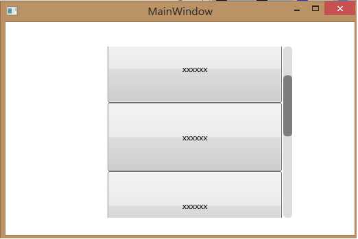
最终运行结果
本例的代码
http://pan.baidu.com/s/1ntI3fXB
Wpf ScrollBar自定义样式,布布扣,bubuko.com
原文:http://www.cnblogs.com/cody1988/p/wpf_ScrollBar.html