.box { flex-direction: row 【横向,这个也是默认的方向!】| row-reverse【横向,元素倒序排列】 | column【纵向排列元素】 | column-reverse【纵向倒序排列元素】 }
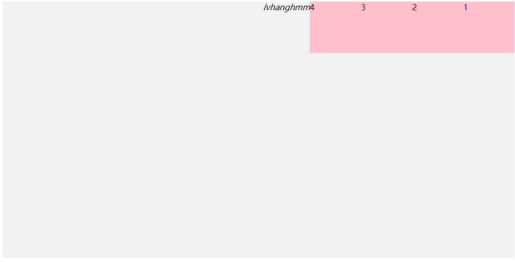
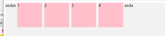
未添加flex代码
<!DOCTYPE html>
<html lang="en">
<head>
<meta charset="UTF-8">
<title>Title</title>
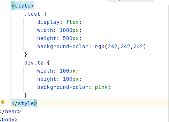
<style>
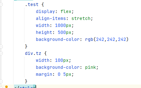
.test {
width: 1000px;
height: 500px;
background-color: rgb(242,242,242)
}
div.tz {
width: 100px;
height: 100px;
background-color: pink;
}
</style>
</head>
<body>
<!--flex-direction属性决定主轴的方向(即项目的排列方向)。-->
<div class="test">
<div class="tz">1</div>
<div class="tz">2</div>
<div class="tz">3</div>
<div class="tz">4</div>
<!-- 这个是行内元素-->
<i>lvhanghmm</i>
</div>
</body>
</html>
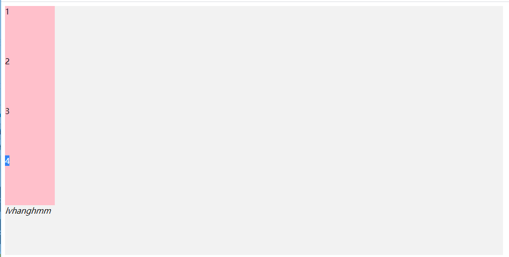
为父元素添加display: flex属性可以看到变成弹性盒子,元素的默认排列
顺序就是横向的!
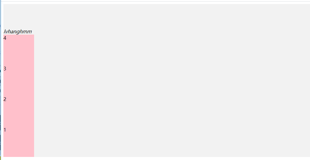
之后添加flex-direction: column属性元素排列方向就变成了纵向了
flex-direction: column-reverse【纵向倒序排列】
flex-direction: row-reverse;【横向倒序排列】
示例代码:
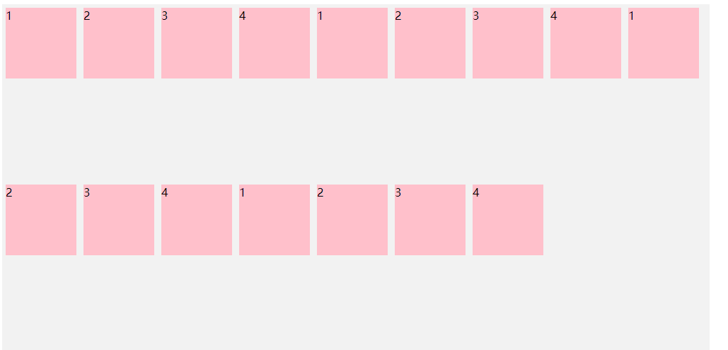
默认情况下,项目都排在一条线(又称"轴线")上。flex-wrap属性定义,如果一条轴线排不下,如何换行。
.box{ flex-wrap: nowrap【不换行】| wrap【换行】 | wrap-reverse;【换行倒序排列】 }
nowrap(默认):不换行。
<!DOCTYPE html>
<html lang="en">
<head>
    <meta charset="UTF-8">
    <title>Title</title>
    <style>
        .test {
            display: flex;
            width: 1000px;
            height: 500px;
            background-color: rgb(242,242,242)
        }
        div.tz {
            width: 100px;
            height: 100px;
            background-color: pink;
            margin: 0 5px;
        }
    </style>
</head>
<body>
<!--flex-direction属性决定主轴的方向(即项目的排列方向)。-->

<div class="test">
    <div class="tz">1</div>
    <div class="tz">2</div>
    <div class="tz">3</div>
    <div class="tz">4</div>
    <div class="tz">1</div>
    <div class="tz">2</div>
    <div class="tz">3</div>
    <div class="tz">4</div>
    <div class="tz">1</div>
    <div class="tz">2</div>
    <div class="tz">3</div>
    <div class="tz">4</div>
    <div class="tz">1</div>
    <div class="tz">2</div>
    <div class="tz">3</div>
    <div class="tz">4</div>
</div>
</body>
</html>
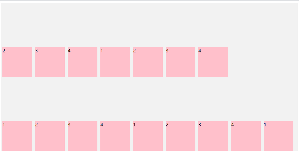
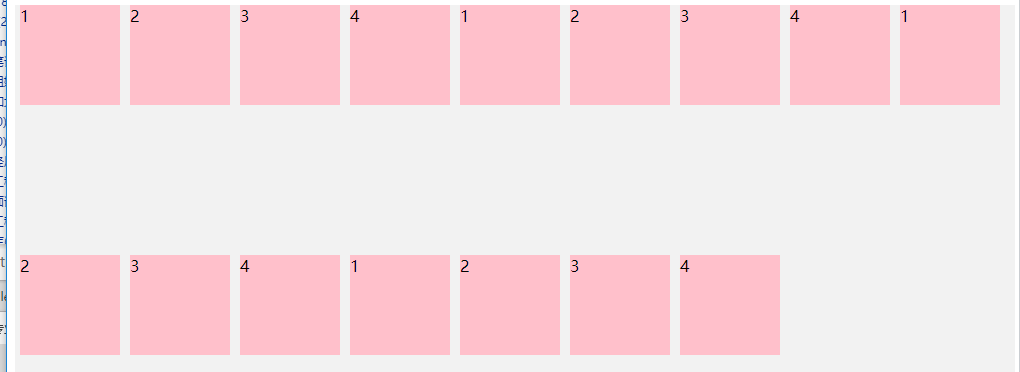
wrap【换行】wrap:换行,第一行在上方。
wrap-reverse【换行倒序排列】wrap-reverse:换行,第一行在下方。
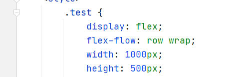
flex-flow属性是flex-direction属性和flex-wrap属性的简写形式,默认值为row nowrap。
.box { flex-flow:
示例代码:
<!DOCTYPE html>
<html lang="en">
<head>
    <meta charset="UTF-8">
    <title>Title</title>
    <style>
        .test {
            display: flex;
            flex-flow: row wrap;
            width: 1000px;
            height: 500px;
            background-color: rgb(242,242,242)
        }
        div.tz {
            width: 100px;
            height: 100px;
            background-color: pink;
            margin: 0 5px;
        }
    </style>
</head>
<body>
<!--flex-direction属性决定主轴的方向(即项目的排列方向)。-->
<div class="test">
    <div class="tz">1</div>
    <div class="tz">2</div>
    <div class="tz">3</div>
    <div class="tz">4</div>
    <div class="tz">1</div>
    <div class="tz">2</div>
    <div class="tz">3</div>
    <div class="tz">4</div>
    <div class="tz">1</div>
    <div class="tz">2</div>
    <div class="tz">3</div>
    <div class="tz">4</div>
    <div class="tz">1</div>
    <div class="tz">2</div>
    <div class="tz">3</div>
    <div class="tz">4</div>
</div>
</body>
</html>
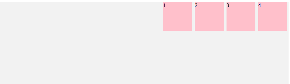
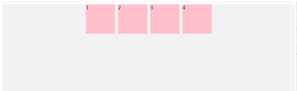
justify-content属性定义了项目在主轴上的对齐方式。
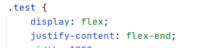
.box { justify-content: flex-start | flex-end | center | space-between | space-around; }
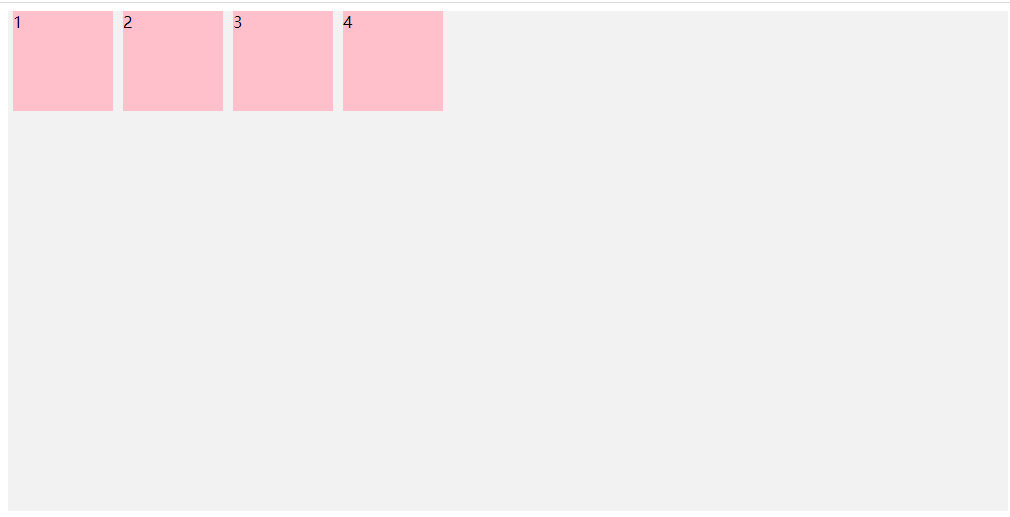
flex-start(默认值):左对齐
示例代码
<!DOCTYPE html>
<html lang="en">
<head>
    <meta charset="UTF-8">
    <title>Title</title>
    <style>
        .test {
            display: flex;
            justify-content: flex-start;
            width: 1000px;
            height: 500px;
            background-color: rgb(242,242,242)
        }
        div.tz {
            width: 100px;
            height: 100px;
            background-color: pink;
            margin: 0 5px;
        }
    </style>
</head>
<body>
<!--flex-direction属性决定主轴的方向(即项目的排列方向)。-->
<div class="test">
    <div class="tz">1</div>
    <div class="tz">2</div>
    <div class="tz">3</div>
    <div class="tz">4</div>
</div>
</body>
</html>
flex-end:右对齐
center: 居中【水平居中】
space-between:两端对齐,项目之间的间隔都相等。
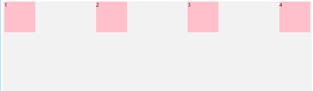
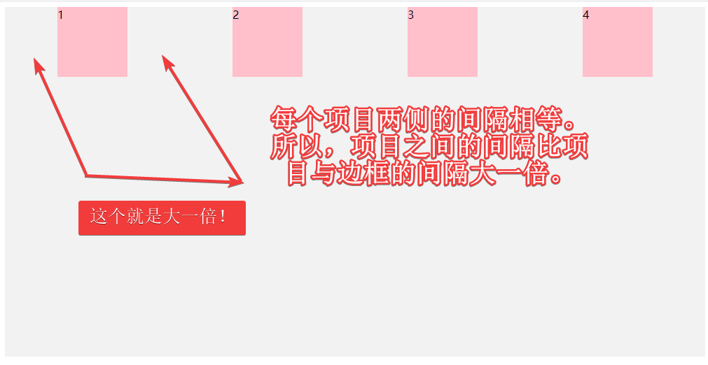
space-around:每个项目两侧的间隔相等。所以,项目之间的间隔比项目与边框的间隔大一倍。
align-items属性定义项目在交叉轴上如何对齐。【解释一下:交叉点指的是父元素左上角和左下角的十字架的两个点,左上角是起点,左下角是终点】
.box { align-items: flex-start | flex-end | center | baseline | stretch; }
flex-start:交叉轴的起点对齐。【酶反应!?!!!】
示例代码:
<!DOCTYPE html>
<html lang="en">
<headw>
    <meta charset="UTF-8">
    <title>Title</title>
    <style>
        .test {
            display: flex;
            align-items: flex-start;
            width: 1000px;
            height: 500px;
            background-color: rgb(242,242,242)
        }
        div.tz {
            width: 100px;
            height: 100px;
            background-color: pink;
            margin: 0 5px;
        }
    </style>
</head>
<body>
<!--flex-direction属性决定主轴的方向(即项目的排列方向)。-->
<div class="test">
    <div class="tz">1</div>
    <div class="tz">2</div>
    <div class="tz">3</div>
    <div class="tz">4</div>
</div>
</body>
</html>
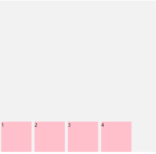
flex-end:交叉轴的终点对齐。
baseline: 项目的第一行文字的基线对齐。【不明所以!】
stretch(默认值):如果项目未设置高度或设为auto,将占满整个容器的高度。
我把子元素的高度去掉了!
元素占满整个容器的高度
6、align-content 属性
align-content属性定义了多根轴线(多行)的对齐方式。如果项目只有一根轴线,该属性不起作用。
.box { align-content: flex-start | flex-end | center | space-between | space-around | stretch; }
flex-start:交叉轴的起点对齐。
原文:https://www.cnblogs.com/lvhanghmm/p/14988708.html