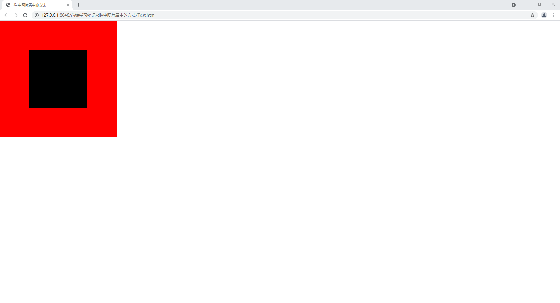
一.利用flex布局,使元素在x轴与y轴上都居中
<!DOCTYPE html>
<html>
	<head>
		<meta charset="utf-8">
		<title>div中图片居中的方法</title>
		<style>
			. {
				margin: 0px;
				padding: 0px;
			}

			body {
				width: 100%;
				height: 100%;
				margin: 0px;
			}

			#wrap {
				width: 400px;
				height: 400px;
				background-color: red;
				/*主要代码*/
				display: flex;
				justify-content: center;
				align-items: center;
			}

			#picture{
				width: 200px;
				height: 200px;
				background-color: black;
			}
		</style>
	</head>
	<body>
		<div id="wrap">
			<div id="picture"></div>
		</div>
	</body>
</html>
原文:https://www.cnblogs.com/LJW77/p/14947959.html