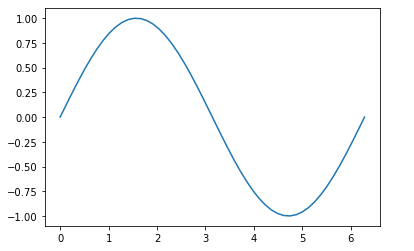
- 画简单的图
import matplotlib.pyplot as plt
import numpy as np
x = np.linspace(0, 2 * np.pi, 50)
y = np.sin(x)
plt.plot(x, y)
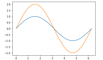
- 同一个图画多个曲线
x = np.linspace(0, 2 * np.pi, 50)
y = np.sin(x)
y_o = 2 * np.sin(x)
plt.plot(x, y)
plt.plot(x, y_o)
plt.show
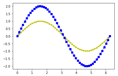
- 设置曲线样式
颜色 表示方式
蓝色 b
绿色 g
红色 r
青色 c
品红 m
黄色 y
黑色 k
白色 w
点的类型 表示方式
点 .
像素 ,
圆 o
方形 s
三角形 ^
线的类型 表示方式
直线 -
虚线 --
点线 :
点划线 -.
x = np.linspace(0, 2 * np.pi, 50)
y = np.sin(x)
y_o = 2 * np.sin(x)
‘y-‘ ,其中 y 表示黄色, 表示 星标的点,- 表示实线
plt.plot(x, y, ‘y*-‘)
plt.plot(x, y_o, ‘bs--‘)
plt.show
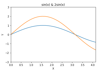
- 你可以认为Matplotlib绘制的图形都在一个默认的 figure 中,当然了,你可以自己创建 figure,好处就是可以控制更多的参数,常见的就是控制图形的大小,这里创建一个 figure,设置大小为 (6, 3)。
plt.figure(figsize=(10, 3))
plt.plot(x, y)
plt.plot(x, y * 2)
plt.show()
plt.plot(x, y)
plt.plot(x, y * 2)
标题
plt.title("sin(x) & 2sin(x)")
x,y轴,通过 xlim 和 ylim 来设限定轴的范围,通过 xlabel 和 ylabel 来设置轴的名称。
plt.xlim((0, np.pi + 1))
plt.ylim((-3, 3))
plt.xlabel(‘X‘)
plt.ylabel(‘Y‘)
plt.show()
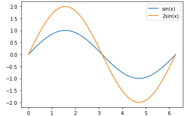
- 设置线的label
plt.plot(x, y, label="sin(x)")
plt.plot(x, y * 2, label="2sin(x)")
plt.legend()
plt.legend(loc=‘best‘)
plt.show()
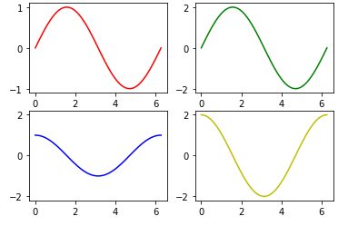
- 使用子图
ax1 = plt.subplot(2, 2, 1) # (行,列,活跃区)
plt.plot(x, np.sin(x), ‘r‘)
ax2 = plt.subplot(2, 2, 2) # 与 ax1 共享y轴
ax2 = plt.subplot(2, 2, 2, sharey=ax1) # 与 ax1 共享y轴
plt.plot(x, 2 * np.sin(x), ‘g‘)
ax3 = plt.subplot(2, 2, 3)
plt.plot(x, np.cos(x), ‘b‘)
ax4 = plt.subplot(2, 2, 4, sharey=ax3) # 与 ax3 共享y轴
plt.plot(x, 2 * np.cos(x), ‘y‘)
plt.show()
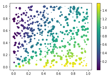
- 散点图
k = 500
x = np.random.rand(k)
print(x.shape)
y = np.random.rand(k)
size = np.random.rand(k) * 50 # 生成每个点的大小
colour = np.arctan2(x, y) # 生成每个点的颜色大小
print(colour.shape)
plt.scatter(x, y, s=size, c=colour)
plt.colorbar() # 添加颜色栏
plt.show()
- 柱状图我们经常会用到,我们来看下如何画出柱状图,并在图上标注出数据对应的数值。
生成数据 x 和 y 之后,调用 plt.bar 函数绘制出柱状图,然后通过 plt.text 标注数值,设置参数 ha=‘center‘ 横向居中对齐,设置 va=‘bottom‘纵向底部(顶部)对齐。
k = 10
x = np.arange(k)
y = np.random.rand(k)
plt.bar(x, y) # 画出 x 和 y 的柱状图
增加数值
for x, y in zip(x, y):
plt.text(x, y , ‘%.2f‘ % y, ha=‘center‘, va=‘bottom‘)
plt.show()
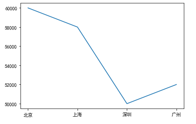
- 中文乱码解决
x = [‘北京‘, ‘上海‘, ‘深圳‘, ‘广州‘]
y = [60000, 58000, 50000, 52000]
plt.rcParams[‘font.sans-serif‘]=[‘SimHei‘] #用来正常显示中文标签
plt.rcParams[‘axes.unicode_minus‘]=False #用来正常显示负号
plt.plot(x, y)
plt.show()
matplotlib 使用
原文:https://www.cnblogs.com/pyclq/p/14777545.html