根据Android 官网文档所属. Button可以定义三种形式的
XML如下
<Button
    android:layout_width="wrap_content"
    android:layout_height="wrap_content"
    android:text="@string/button_text"
    ... />

<ImageButton
    android:layout_width="wrap_content"
    android:layout_height="wrap_content"
    android:src="@drawable/button_icon"
    android:contentDescription="@string/button_icon_desc"
    ... />

<Button
    android:layout_width="wrap_content"
    android:layout_height="wrap_content"
    android:text="@string/button_text"
    android:drawableLeft="@drawable/button_icon"
    ... />
根据官方文档所属.有两种形式可以进行响应Button类型事件
第一种XML形式如下;
<?xml version="1.0" encoding="utf-8"?>
<Button xmlns:android="http://schemas.android.com/apk/res/android"
    android:id="@+id/button_send"
    android:layout_width="wrap_content"
    android:layout_height="wrap_content"
    android:text="@string/button_send"
    android:onClick="sendMessage" />
指定Button 响应的方法为 sendMessage
在Active中声明并实现
public void sendMessage(View view) {
    // Do something in response to button click
    //提示一个信息两秒钟消失
    Toast.makeText(this, "点击了我", Toast.LENGTH_SHORT).show();
}
注意
1.方法修饰必须是公共的(Public)
2.无返回值 void
3.比如传入一个View 参数
为啥这样做.在Android中我们声明一个Button类型的变量 在上面 按快捷键 CTRL+H 可以看类继承结构我们可以发现是继承自 TextView类.那么说明可以使用TextView类中的方法. 而继续网上看可以看到是继承自Viw类. 所以里的View其实就是父类引用. 可以接纳任何继承自View的子类对象
第二种方式,使用OnClickListener 方法
这里我们需要走三步
1.声明Button 变量
2.寻找Button Id
3.使用 setOnClickListener 来实现按钮点击事件
public Button m_BtnText;
m_BtnText = (Button)findViewById(R.id.m_btnText);  //你在xml为button分配的ID
m_BtnText.setOnClickListener()					   //这里需要一个OnClickListerner对象.有两种方式, 第一种使用 匿名内部类.创建一个.然后实现里面的OnClick方法. 第二种就是你继承然后并且实现这个方法. 这里传入这个类的对象
Button继承自TextView.所以一些属性都是可以用的
text  =  指定文本
textSize 指定文字大熊啊
textColor 指定文字颜色等
<!-- 使用Xml指定Click的形式进行代码操作 函数为sendMsg-->
<Button
android:id="@+id/btn_Id1"
android:layout_width="200dp"
android:layout_height="70dp"
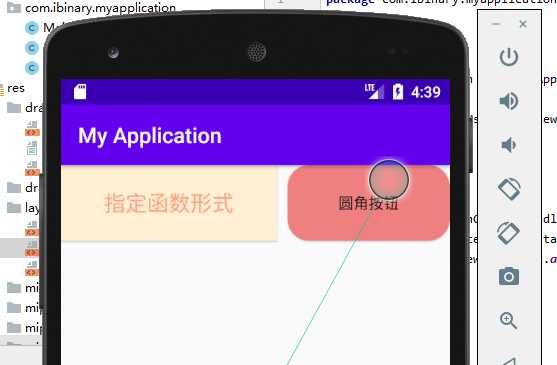
android:text="指定函数形式"
android:textSize="20sp"
android:textColor="#FFA07A"
android:background="#FFEFD5"
android:onClick="sendMsg">
</Button>
圆角Button跟上面一样,唯一不同的就是 background 位置我们要引用一个描述Button的xml文件. 文件还是放在 drawable 文件中
1.首先在drawable新建资源文件, 文件类型为 shape
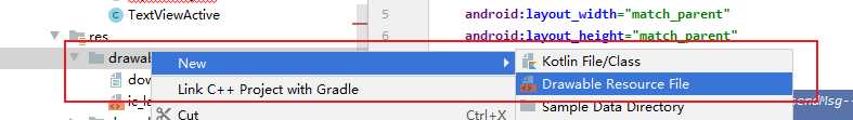
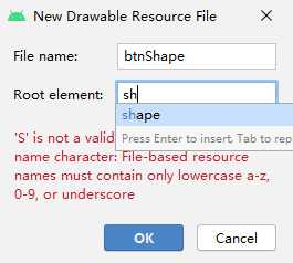
新建的shape写如下
关于 shape进阶可以查看 博客 https://www.jianshu.com/p/ef734937b521
<?xml version="1.0" encoding="utf-8"?>
<shape xmlns:android="http://schemas.android.com/apk/res/android"
    android:shape="rectangle">

<!--    设置实心-->
    <solid android:color="#F08080">
    </solid>
<!--    设置圆角-->
    <corners android:radius="20dp">

    </corners>

<!--    backgound引用即可-->
</shape>
首先指定了 shape为 rectangle 指定了按钮为矩形方式
然后设置实心的背景颜色
最后设置圆角. radius是设置四个角.对应的还有左上 右上 右下 左下等.
button xml描述文件如下
   <!--设置按钮圆角 需要设置Drawable-->
    <Button
        android:id="@+id/btn_Id2"
        android:layout_width="200dp"
        android:layout_height="70dp"
        android:layout_toRightOf="@id/btn_Id1"
        android:layout_marginLeft="10dp"
        android:background="@drawable/btn_shape"
        android:text="圆角按钮">
    </Button>
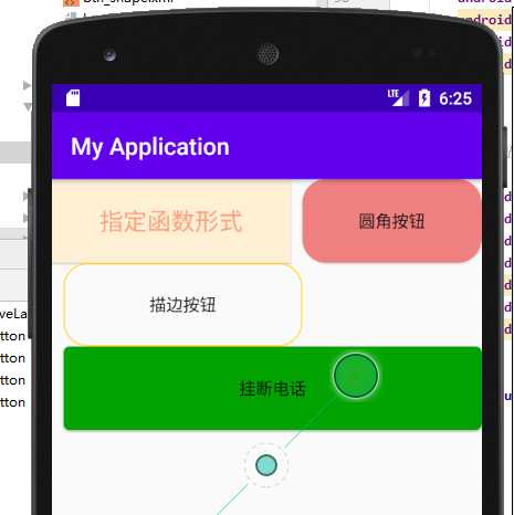
运行效果截图
复制一个shape xml文件修改位如下
<?xml version="1.0" encoding="utf-8"?>
<shape xmlns:android="http://schemas.android.com/apk/res/android"
    android:shape="rectangle">

    <!--    设置描边-->
    <stroke
        android:color="#FFD700"
        android:width="1dp">

    </stroke>
    <!--    设置圆角-->
    <corners android:radius="20dp">

    </corners>

    <!--    backgound引用即可-->
</shape>
xml代码描述如下
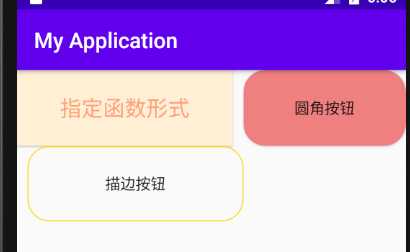
<!--    设置描边按钮-->
    <Button
        android:id="@+id/btn_Id3"
        android:layout_width="200dp"
        android:layout_height="70dp"
        android:layout_below="@id/btn_Id1"
        android:layout_marginLeft="10dp"
        android:background="@drawable/btn_shape1"
        android:text="描边按钮">

    </Button>
运行之后效果演示
我们的控件是运行在android手机上的.当按钮按钮的时候会产生效果.
比如按钮当没按压的时候的颜色跟按压的时候的颜色是不一样的.
这里使用xml实现,这里要使用一个 状态选择器的 xml文件来描述
状态选择器参考资料 进阶 https://blog.csdn.net/qq_20451879/article/details/80340823
首先跟创建shape文件一样,只不过此时修改为select
selectxml文件如下
<?xml version="1.0" encoding="utf-8"?>
<selector xmlns:android="http://schemas.android.com/apk/res/android">
<!--    状态选择器 android:state_pressed = true代表按压-->
    <item android:state_pressed="true">
<!--        如果是按压,那么我们使用shape画一个-->
        <shape>
<!--            设置实心颜色,并且设置圆角-->
            <solid android:color="#ff0000"></solid>
            <corners android:radius="5dp"></corners>
        </shape>
    </item>

<!--    否则设置为绿色-->
    <item android:state_pressed="false">
        <!--        如果是按压,那么我们使用shape画一个-->
        <shape>
            <!--            设置实心颜色,并且设置圆角-->
            <solid android:color="#0ca30c"></solid>
            <corners android:radius="5dp"></corners>
        </shape>
    </item>
</selector>
button中的按钮四进行引用
<!--    设置按钮按压状态-->
    <Button
        android:id="@+id/btn_Id4"
        android:layout_width="match_parent"
        android:layout_height="70dp"
        android:layout_below="@id/btn_Id3"
        android:layout_marginLeft="10dp"
        android:background="@drawable/btn_4"
        android:text="挂断电话">

    </Button>
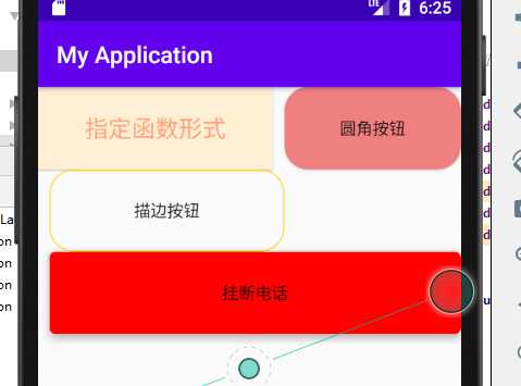
运行之后显示效果
未按压
按压
Android 开发第五讲 学习Button了解Button属性
原文:https://www.cnblogs.com/iBinary/p/13585237.html