本文主要介绍基本元素 TextInput, TextField, TextEdit, TextArea 等的基本属性。Textlnput 与 TextField 为行编辑控件,TextEdit 与 TextArea 为块编辑控件。
Textinput 用于编辑一行文本,类似于 QLineEdit,除了显示光标和文本外,默认并没有边框等装饰性效果,所以在使用时一般要为其添加一个可视化的外观。
Window {
    visible: true
    width: 320
    height: 240

    Row {
        spacing: 10
        anchors.centerIn: parent

        Text {
        	text: qsTr("请输入密码:") ;
        	font.pointSize: 15
            verticalAlignment: Text.AlignVCenter
        }

        Rectangle {
            width: 100
            height: 24
            color: "lightgrey"
            border.color: "grey"

            TextInput {
                anchors.fill: parent
                anchors.margins: 2
                font.pointSize: 15
                focus: true
            }
        }
    }
}
Textinput 默认并没有边框,所以上面使用 Rectangle 作为其边框,程序运行效果如下图所示:

下面介绍其一些属性:
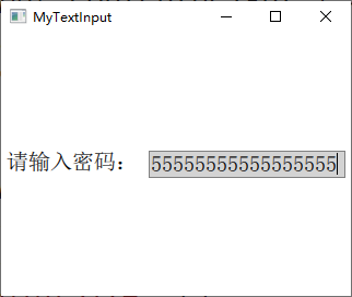
按照前面的代码已经为 TextInput 设置了一个基本的外观,但是如果输入过多的内容时,会显示到背景之外,如下图所示:

所以要根据输入的内容来动态改变输入框背景的尺寸,这个可以通过 contentWidth 和 contentHeight 属性来根据输入内容的宽高设置背景矩形的大小,将前面代码更改如下:
Rectangle {
    width: input.contentWidth<100 ? 100 : input.contentWidth + 10
    height: input.contentHeight + 5
    color: "lightgrey"
    border.color: "grey"

    TextInput {
        id: input
        anchors.fill: parent
        anchors.margins: 2
        font.pointSize: 15
        focus: true
    }
}
运行效果如下图所示:
可以使用输入掩码 inputMask 来限制输入的内容,输入掩码就是使用一些特殊的字符来限制输入的格式和内容,举个简单的例子,你想让用户输入类似于 "2014-01-30" 这种格式的日期, 可以将 inputMask 设置为 "0000-00-00"。可用的掩码字符如下表所示。
| 字符(必须输入) | 字符(可留空) | 含义 |
|---|---|---|
| A | a | 只能输入A-Z,a-z |
| N | n | 只能输入A-Z,a-z,0-9 |
| X | x | 可以输入任意字符 |
| 9 | 0 | 只能输入0-9 |
| D | d | 只能输入1-9 |
| # | 只能输入加号(+),减号(-),0-9 | |
| H | h | 只能输入十六进制字符,A-F,a-f,0-9 |
| B | b | 只能输入二进制字符,0或1 |
| 字符 | 含义 |
|---|---|
| > | 后面的字母字符自动转换为大写 |
| < | 后面的字母字符自动转换为小写 |
| ! | 停止字母字符的大小写转换 |
| [ ] { } | 括号中的内容会直接显示出来 |
| \ | 将该表中的特殊字符正常显示用作分隔符 |
下面来看示例代码:
Rectangle {
    width: input.contentWidth<100 ? 100 : input.contentWidth + 10
    height: input.contentHeight + 5
    color: "lightgrey"
    border.color: "grey"

    TextInput {
        id: input
        anchors.fill: parent
        anchors.margins: 2
        font.pointSize: 15
        focus: true

        inputMask: ">AA_9_a"
        onEditingFinished: text2.text = text
    }
}

Text { id: text2}
当输入完成后可以按下回车键,这时会调用 onEditingFinished 信号处理器,在其中可以对输入的文本进行处理。注意,只有当所有必须输入的字符都输入后,按下回车键才可以调用该信号处理器,比如这里的掩码字符 9 要求必须输入一个数字,如果不输入而是直接留空,那么按下回车键也没有效果。代码运行效果如下图所示:

除了使用掩码,还可以使用整数验证器 IntValidator 、DoubleValidator(非整数验证器)和RegExpValidator(正则表达式验证器)。下面的代码可以限制在 TextInput 中只能输入 11 到 31 之间的整数:
validator: IntValidator{ bottom: 11; top: 31; }
对于正则表达式的使用,可以参考网上教程。
TextInput项目的 echoMode 属性指定了文本的显示方式,可用的方式有:
下面来看示例代码:
TextInput {
    id: input
    focus: true
    echoMode: TextInput.PasswordEchoOnEdit

    onEditingFinished: {
        input.focus = false
        text2.text = text
    }
}
代码先设置了 TextInput 获得焦点,这样输入字符会直接显示,等输入完成按下回车键以后使 TextInput 失去焦点,这样输入的字符会用密码掩码显示。效果如下图所示:

如果 echoMode 不为 Textlnput.Normal,那么 displayText 属性就保存显示给用户的文本,而 text 属性则保存实际输入的文本,比如你设定 passwordCharacter 为 *, echoMode为TextInput.Password,那么displayText属性内保存的就是一串 *。
TextEdit 是 Qt Quick 提供的多行文本编辑框,它的大多数属性与 Textinput 类似。下面只说不同之处:
文本颜色
TextInput 的文本颜色使用 color 属性指定,TextField 的文本颜色使用 textColor 属性指定。
背景色
TextInput 没有背景,是透明的,能够与父控件无缝结合;而 TextField 有背景,其背景色可通过 TextFieldStyle 的 background 属性来设定,其他属性都一样。
富文本
Textlnput 不支持使用 HTML 标记的富文本,而 TextEdit 可以。
示例如下:
import QtQuick 2.9
import QtQuick.Window 2.2

Window {
    visible: true
    width: 640
    height: 480

    TextEdit {
        width: 240
        textFormat: Text.RichText
        text: "<b>Hello</b> <i>World!</i>"
        font.family: "Helvetica"
        font.pointSize: 20
        color: "blue"
        focus: true
        anchors.centerIn: parent
    }
}

运行代码可以看到,TextEdit 没有提供滚动条、光标跟随和其它在可视部件中通常具有的行为。为了更加人性化的体验,我们可以使用 Flickable 来为其提供滚动,实现光标跟随。下面来看一段示例代码:
Window {
    visible: true
       width: 640
       height: 480

       Flickable {
           id: flick

           anchors.fill: parent
           contentWidth: edit.paintedWidth
           contentHeight: edit.paintedHeight
           clip: true

           function ensureVisible(r)
           {
               if (contentX >= r.x)
                   contentX = r.x;
               else if (contentX+width <= r.x+r.width)
                   contentX = r.x+r.width-width;
               if (contentY >= r.y)
                   contentY = r.y;
               else if (contentY+height <= r.y+r.height)
                   contentY = r.y+r.height-height;
           }

           TextEdit {
               id: edit
               width: flick.width
               height: flick.height
               font.pointSize: 15
               wrapMode: TextEdit.Wrap
               focus: true
               onCursorRectangleChanged:
                   flick.ensureVisible(cursorRectangle)
           }
       }

       Rectangle {
           id: scrollbar
           anchors.right: flick.right
           y: flick.visibleArea.yPosition * flick.height
           width: 10
           height: flick.visibleArea.heightRatio * flick.height
           color: "lightgrey"
       }
}
这里使用的 Flickable 类型到后面会详细讲解。在 TextEdit 中可以设置 selectByMouse 属性为 true 来使鼠标可以选取文本内容,可以直接通过键盘快捷键实现文本的复制、粘贴、撤销等操作,当然也可以使用相应的函数来完成。运行效果如下图所示:

参考:
《Qt Quick核心编程》第9章
QML学习(五)—<TextInput和TextEdit输入栏>
QML 常用控件:TextInput, TextField, TextEdit, TextArea(编辑框)用法及自定义
原文:https://www.cnblogs.com/linuxAndMcu/p/13564090.html