时间序列数据就是随着时间发展变化(不变化)的数据
可以画共轴的子图,查看多个属性随时间变化的趋势
# Plot the time series in each dataset
fig, axs = plt.subplots(2, 1, figsize=(5, 10))
data.iloc[:1000].plot(y='data_values', ax=axs[0])
data2.iloc[:1000].plot(y='data_values', ax=axs[1])
plt.show()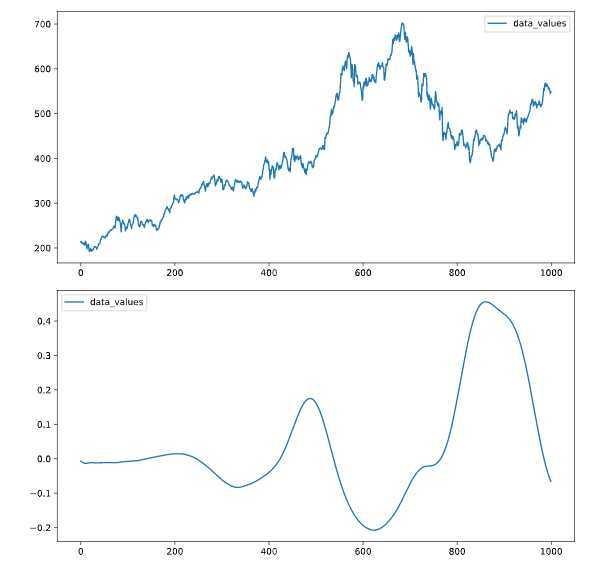
我再一次复习pd[[]]可以同时提取数据框的子集
*双中括号提取子列**
from sklearn.svm import LinearSVC

# Construct data for the model
X = data[["petal length (cm)" , "petal width (cm)"]]
y = data[['target']]

# Fit the model
model = LinearSVC()
model.fit(X, y)
还有就是想画在一个图的,公用y轴,如上述
reshape
给定数组或者数据框一个新的形状而不改变数据
其中常见的就是reshape(-1,1):数据集可以变成一列,之前matlab处理图像时候也有一个函数,忘记叫啥了,把像素归为一列
一般拟合完模型,进行预测,可直接使用predict
glob模块的主要方法就是glob,该方法返回所有匹配的文件路径列表(list);该方法需要一个参数用来指定匹配的路径字符串(字符串可以为绝对路径也可以为相对路径),其返回的文件名只包括当前目录里的文件名,不包括子文件夹里的文件。
librosa是一个非常强大的python语音信号处理的第三方库cnblog
import librosa as lr
from glob import glob

# List all the wav files in the folder
audio_files = glob(data_dir + '/*.wav')

# Read in the first audio file, create the time array
audio, sfreq = lr.load(audio_files[0])
time = np.arange(0, len(audio)) / sfreq

# Plot audio over time
fig, ax = plt.subplots()
ax.plot(time, audio)
ax.set(xlabel='Time (s)', ylabel='Sound Amplitude')
plt.show()
{{uploading-image-900268.png(uploading...)}}
原文:https://www.cnblogs.com/gaowenxingxing/p/12441388.html