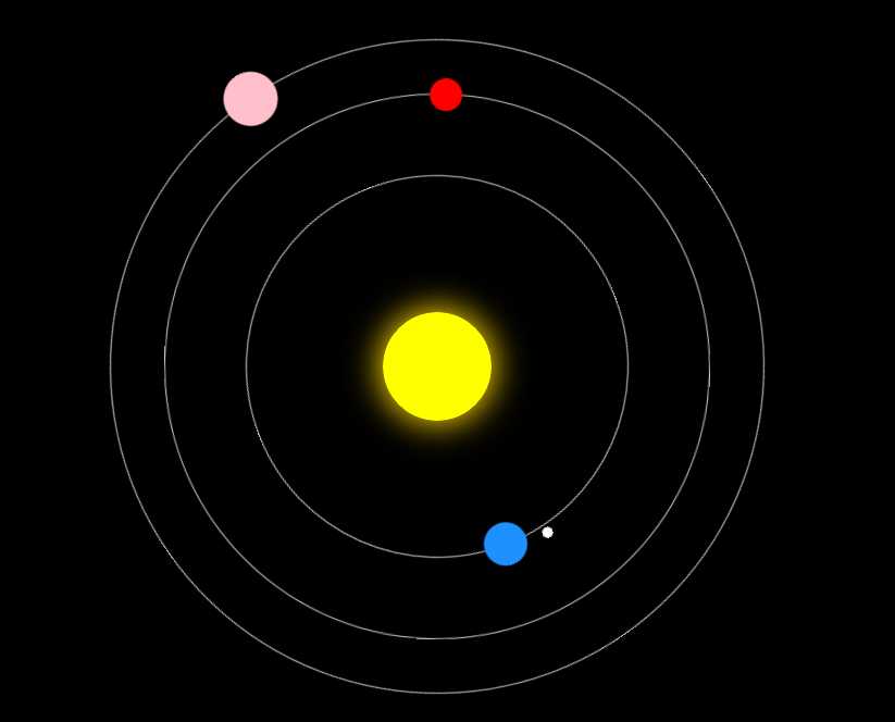
<!DOCTYPE html>
<html>
    <head>
        <meta charset="UTF-8">
        <title></title>
        <style>
            body{
                background: #000;
                overflow: hidden;
            }
            .sun{
                width: 100px;
                height: 100px;
                position: absolute;
                left: 50%;
                top: 50%;
                transform: translate(-50%,-50%);
                background: yellow;
                box-shadow: 0 0 30px 3px gold;
                border-radius: 50%;
            }
            .earth{
                width: 350px;
                height: 350px;
                position: absolute;
                left: 50%;
                top: 50%;
                /*保证居中*/
                transform: translate(-50%,-50%);
                border: 1px solid #ccc;
                border-radius: 50%;
                animation: rot 8s linear infinite;
            }
            .earth::before{
                content: "";
                width: 40px;
                height: 40px;
                position: absolute;
                left: 0;
                top: 50%;
                transform: translate(-50%,-50%);
                background: dodgerblue;
                border-radius: 50%;
            }
            .moon{
                width: 80px;
                height: 80px;
                position: absolute;
                left: 0;
                top: 50%;
                transform: translate(-50%,-50%);
                border-radius: 50%;
                animation: rot 2s linear infinite;
            }
            .moon::before{
                content: "";
                width: 10px;
                height: 10px;
                position: absolute;
                left: 0;
                top: 50%;
                transform: translate(-50%,-50%);
                background: #fff;
                border-radius: 50%;
            }
            .venus{
                width: 500px;
                height: 500px;
                position: absolute;
                left: 50%;
                top: 50%;
                transform: translate(-50%,-50%);
                border: 1px solid #ccc;
                border-radius: 50%;
                animation: rot 6s linear infinite;
            }
            .venus::before{
                content: "";
                width: 30px;
                height: 30px;
                position: absolute;
                left: 0;
                top: 50%;
                transform: translate(-50%,-50%);
                background: red;
                border-radius: 50%;
            }
            .mars{
                width: 600px;
                height: 600px;
                position: absolute;
                left: 50%;
                top: 50%;
                transform: translate(-50%,-50%);
                border: 1px solid #ccc;
                border-radius: 50%;
                animation: rot 10s linear infinite;
            }
            .mars::before{
                content: "";
                width: 50px;
                height: 50px;
                position: absolute;
                left: 0;
                top: 50%;
                transform: translate(-50%,-50%);
                background: pink;
                border-radius: 50%;
            }
            @keyframes rot{
                0%{
                    transform:translate(-50%,-50%) rotate(0deg);
                }
                100%{
                    transform:translate(-50%,-50%) rotate(360deg);
                }
            }
        </style>
    </head>
    <body>
        <div class="sun">
            <div class="earth">
                <div class="moon"></div>
            </div>
        </div>
        <div class="venus"></div>
        <div class="mars"></div>

    </body>
</html>
原文:https://www.cnblogs.com/gxywb/p/11928516.html