<!DOCTYPE html>
<html lang="en">
<head>
<meta charset="UTF-8">
<meta name="viewport" content="width=device-width, initial-scale=1.0">
<meta http-equiv="X-UA-Compatible" content="ie=edge">
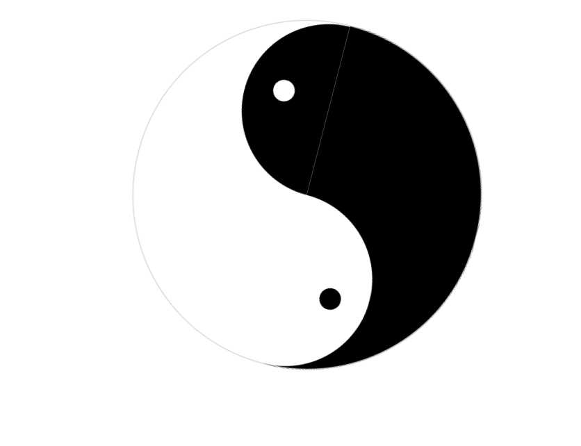
<title>太极图</title>
<style type="text/css">
.taiji {
margin:50px auto 0;
height:400px;
width:400px;
animation:run-inner 1s infinite linear;
}
@keyframes run-inner {
0% {
transform:rotate(0deg)
}
25% {
transform:rotate(-90deg)
}
50% {
transform:rotate(-180deg)
}
75% {
transform:rotate(-270deg)
}
100% {
transform:rotate(-360deg)
}
}
.a {
width:400px;
height:200px;
border:1px solid #D3D3D3;
border-bottom:0px;
border-radius:200px 200px 0px 0px;
background:#fff;
position:relative;
}
.a:after {
content:"";
background:#fff;
width:25px;
height:25px;
border-radius:50%;
position:absolute;
top:132px;
left:297px;
}
.a .inner {
width:200px;
height:100px;
position:absolute;
bottom:0;
right:0;
background:#000;
border-radius:100px 100px 0 0;
}
.b {
width:400px;
height:200px;
border:1px solid #D3D3D3;
border-top:0px;
border-radius:0 0 200px 200px;
background:#000;
position:relative;
}
.b:after {
content:"";
background:#000;
width:25px;
height:25px;
border-radius:50%;
position:absolute;
bottom:132px;
right:297px;
}
.b .inner {
width:200px;
height:100px;
position:absolute;
top:0;
left:0;
background:#fff;
border-radius:0 0 100px 100px;
}
</style>
</head>
<body>
<div class="taiji">
<div class="a">
<div class="inner">
</div>
</div>
<div class="b">
<div class="inner">
</div>
</div>
</div>
</body>
</html>
通过css样式简单实现动态太极图
原文:https://www.cnblogs.com/wanghua3/p/11870919.html