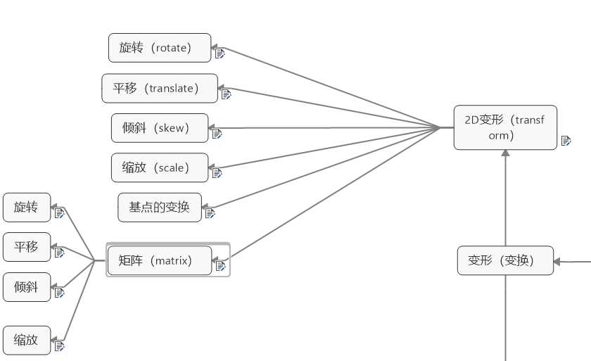
1.transfrom:rotate(360deg); 用前要加transition: 2s; deg重点
transform:rotate(angle);
正值:顺时针旋转 rotate(360deg)
负值:逆时针旋转 rotate(-360deg)
只能设单值。正数表示顺时针旋转,负数表示逆时针旋转
transform: rotate(360deg);

<!DOCTYPE html>
<html>
    <head>
        <meta charset="UTF-8">
        <title></title>
        <style type="text/css">
            #test{
                width: 200px;
                height: 200px;

                border:3px solid red;
                background: pink;
                text-align: center;
                font: 20px/200px "微软雅黑" ;

                position: absolute;
                left: 0;
                right: 0;
                bottom: 0;
                top: 0;
                margin: auto;
              transition: 2s;

            }
            html{
                height: 100%;
            }
            html body{
                  height: 60%;
                  border: 3px solid yellow;
                  margin-top: 100px;

            }
            body:hover #test{
                transform: rotate(360deg);
            }


        </style>


    </head>
    <body>
        <div id="test">
        transform
        </div>
    </body>
</html>
X方向平移:transform: translateX(tx)
Y方向平移:transform: translateY(ty)
二维平移:transform: translate(tx[, ty]); 如果ty没有指定,它的值默认为0。
可设单值,也可设双值。
正数表示XY轴正向位移,负数为反向位移。设单值表示只X轴位移,Y轴坐标不变,
例如transform: translate(100px);等价于transform: translate(100px,0);
transform:translateX(300px);
<!DOCTYPE html>
<html>
    <head>
        <meta charset="UTF-8">
        <title></title>
        <style type="text/css">
            #test{
                width: 200px;
                height: 200px;

                border:3px solid red;
                background: pink;
                text-align: center;
                font: 15px/200px "微软雅黑" ;

                position: absolute;
                left: 0;
                right: 0;
                bottom: 0;
                top: 0;
                margin: auto;
              transition: 2s;

            }
            html{
                height: 100%;
            }
            html body{
                  height: 60%;
                  border: 3px solid yellow;
                  margin-top: 100px;

            }
            body:hover #test{
                transform:translateX(300px);
            }


        </style>


    </head>
    <body>
        <div id="test">
        transform:translateX(300px);
        </div>
    </body>
</html>
倾斜 skew
X方向倾斜:transform: skewX(angle)
skewX(45deg):参数值以deg为单位 代表与y轴之间的角度
Y方向倾斜:transform: skewY(angle)
skewY(45deg):参数值以deg为单位 代表与x轴之间的角度
二维倾斜:transform: skew(ax[, ay]); 如果ay未提供,在Y轴上没有倾斜
skew(45deg,15deg):参数值以deg为单位 第一个参数代表与y轴之间的角度
第二个参数代表与x轴之间的角度
单值时表示只X轴扭曲,Y轴不变,如transform: skew(30deg);等价于 transform: skew(30deg, 0);
考虑到可读性,不推荐用单值,应该用transform: skewX(30deg);。skewY表示 只Y轴扭曲,X轴不变
正值:拉正斜杠方向的两个角
负值:拉反斜杠方向的两个角
transform:skewX(45deg);
<!DOCTYPE html>
<html>
    <head>
        <meta charset="UTF-8">
        <title></title>
        <style type="text/css">
            #test{
                width: 200px;
                height: 200px;

                border:3px solid red;
                background: pink;
                text-align: center;
                font: 15px/200px "微软雅黑" ;

                position: absolute;
                left: 0;
                right: 0;
                bottom: 0;
                top: 0;
                margin: auto;
              transition: 2s;

            }
            html{
                height: 100%;
            }
            html body{
                  height: 60%;
                  border: 3px solid yellow;
                  margin-top: 100px;

            }
            body:hover #test{
                transform:skewX(45deg);
            }


        </style>


    </head>
    <body>
        <div id="test">
        transform:skewX(45deg);
        </div>
    </body>
</html>
缩放Scale
transform:scale(2);
X方向缩放:transform: scaleX(sx);
Y方向缩放:transform: scaleY(sy);
二维缩放 :transform: scale(sx[, sy]); (如果sy 未指定,默认认为和sx的值相同)
要缩小请设0.01~0.99之间的值,要放大请设超过1的值。
例如缩小一倍可以transform: scale(.5);
放大一倍可以transform: scale(2);
如果只想X轴缩放,可以用scaleX(.5)相当于scale(.5, 1)。
同理只想Y轴缩放,可以用scaleY(.5)相当于scale(1, .5)
正值:缩放的程度
负值:不推荐使用(有旋转效果)
单值时表示只X轴,Y轴上缩放粒度一样,如transform: scale(2);等价于transform: scale(2,2);
transform:scale(2);
<!DOCTYPE html>
<html>
    <head>
        <meta charset="UTF-8">
        <title></title>
        <style type="text/css">
            #test{
                width: 200px;
                height: 200px;

                border:3px solid red;
                background: pink;
                text-align: center;
                font: 15px/200px "微软雅黑" ;

                position: absolute;
                left: 0;
                right: 0;
                bottom: 0;
                top: 0;
                margin: auto;
              transition: 2s;

            }
            html{
                height: 100%;
            }
            html body{
                  height: 60%;
                  border: 3px solid yellow;
                  margin-top: 100px;

            }
            body:hover #test{
                transform:scale(2);
            }


        </style>


    </head>
    <body>
        <div id="test">
        transform:scale(2);
        </div>
    </body>
</html>
基点的转换 transform-origin:left top;
transform-origin: left top;
<!DOCTYPE html>
<html>
    <head>
        <meta charset="UTF-8">
        <title></title>
        <style type="text/css">
            #test{
                width: 200px;
                height: 200px;

                border:3px solid red;
                background: pink;
                text-align: center;
                font: 15px/100px "微软雅黑" ;

                position: absolute;
                left: 0;
                right: 0;
                bottom: 0;
                top: 0;
                margin: auto;
              transition: 2s;
              transform-origin: left top;

            }
            html{
                height: 100%;
            }
            html body{
                  height: 60%;
                  border: 3px solid yellow;
                  margin-top: 100px;

            }
            body:hover #test{
                transform:rotate(360DEG);
            }


        </style>


    </head>
    <body>
        <div id="test">
         transform-origin: left top;基点转换
        </div>
    </body>
</html>
原文:https://www.cnblogs.com/hack-ing/p/11777126.html
