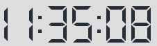
在生活中我们看到电子表的显示方式
现在我们就实现这样的效果,核心就是每个数字构建后再合并,话不多说上代码
html结构
 <div class="light">
     <div class="digits"></div>
 </div>
css结构
/*  The Digits  */
        .light{
            width: 200px;
            background: #f4f5f7;
            height: 60px;
            text-align: center;
        }
        .digits div{
            text-align:left;
            position:relative;
            width: 28px;
            height:50px;
            display:inline-block;
            margin:0 4px;
        }
        .light .digits div span {
            background-color: #272e38;
            border-color: #272e38;
        }

        .digits div span{
            opacity:0;
            position:absolute;
            -webkit-transition:0.25s;
            -moz-transition:0.25s;
            transition:0.25s;
        }
        .digits div span:before,
        .digits div span:after{
            content:‘‘;
            position:absolute;
            width:0;
            height:0;
            border:5px solid transparent;
        }

        .digits .d1{			height:5px;width:16px;top:0;left:6px;}
        .digits .d1:before{	border-width:0 5px 5px 0;border-right-color:inherit;left:-5px;}
        .digits .d1:after{	border-width:0 0 5px 5px;border-left-color:inherit;right:-5px;}

        .digits .d2{			height:5px;width:16px;top:24px;left:6px;}
        .digits .d2:before{	border-width:3px 4px 2px;border-right-color:inherit;left:-8px;}
        .digits .d2:after{	border-width:3px 4px 2px;border-left-color:inherit;right:-8px;}

        .digits .d3{			height:5px;width:16px;top:48px;left:6px;}
        .digits .d3:before{	border-width:5px 5px 0 0;border-right-color:inherit;left:-5px;}
        .digits .d3:after{	border-width:5px 0 0 5px;border-left-color:inherit;right:-5px;}

        .digits .d4{			width:5px;height:14px;top:7px;left:0;}
        .digits .d4:before{	border-width:0 5px 5px 0;border-bottom-color:inherit;top:-5px;}
        .digits .d4:after{	border-width:0 0 5px 5px;border-left-color:inherit;bottom:-5px;}

        .digits .d5{			width:5px;height:14px;top:7px;right:0;}
        .digits .d5:before{	border-width:0 0 5px 5px;border-bottom-color:inherit;top:-5px;}
        .digits .d5:after{	border-width:5px 0 0 5px;border-top-color:inherit;bottom:-5px;}

        .digits .d6{			width:5px;height:14px;top:32px;left:0;}
        .digits .d6:before{	border-width:0 5px 5px 0;border-bottom-color:inherit;top:-5px;}
        .digits .d6:after{	border-width:0 0 5px 5px;border-left-color:inherit;bottom:-5px;}

        .digits .d7{			width:5px;height:14px;top:32px;right:0;}
        .digits .d7:before{	border-width:0 0 5px 5px;border-bottom-color:inherit;top:-5px;}
        .digits .d7:after{	border-width:5px 0 0 5px;border-top-color:inherit;bottom:-5px;}


        /* 1 */
        .digits div.one .d5,
        .digits div.one .d7{
            opacity:1;
        }

        /* 2 */
        .digits div.two .d1,
        .digits div.two .d5,
        .digits div.two .d2,
        .digits div.two .d6,
        .digits div.two .d3{
            opacity:1;
        }

        /* 3 */
        .digits div.three .d1,
        .digits div.three .d5,
        .digits div.three .d2,
        .digits div.three .d7,
        .digits div.three .d3{
            opacity:1;
        }

        /* 4 */
        .digits div.four .d5,
        .digits div.four .d2,
        .digits div.four .d4,
        .digits div.four .d7{
            opacity:1;
        }

        /* 5 */
        .digits div.five .d1,
        .digits div.five .d2,
        .digits div.five .d4,
        .digits div.five .d3,
        .digits div.five .d7{
            opacity:1;
        }

        /* 6 */
        .digits div.six .d1,
        .digits div.six .d2,
        .digits div.six .d4,
        .digits div.six .d3,
        .digits div.six .d6,
        .digits div.six .d7{
            opacity:1;
        }


        /* 7 */
        .digits div.seven .d1,
        .digits div.seven .d5,
        .digits div.seven .d7{
            opacity:1;
        }

        /* 8 */
        .digits div.eight .d1,
        .digits div.eight .d2,
        .digits div.eight .d3,
        .digits div.eight .d4,
        .digits div.eight .d5,
        .digits div.eight .d6,
        .digits div.eight .d7{
            opacity:1;
        }

        /* 9 */
        .digits div.nine .d1,
        .digits div.nine .d2,
        .digits div.nine .d3,
        .digits div.nine .d4,
        .digits div.nine .d5,
        .digits div.nine .d7{
            opacity:1;
        }

        /* 0 */
        .digits div.zero .d1,
        .digits div.zero .d3,
        .digits div.zero .d4,
        .digits div.zero .d5,
        .digits div.zero .d6,
        .digits div.zero .d7{
            opacity:1;
        }

        /* dot */
        .digits div.dot{
            width: 5px;
        }
        .dot:after{
            width: 5px;
            height: 5px;
            content: ‘‘;
            position: absolute;
            left: 0;
            bottom: 0px;
            background-color: #272e38;
        }
js结构动态构建
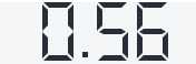
function clocknum(num) {
       $(‘.digits‘).empty();
       var html = ‘‘;
       var strarr = num.toString().split(‘‘);
       var digit_to_name = ‘zero one two three four five six seven eight nine‘.split(‘ ‘);
       for(var i=0; i<strarr.length; i++){
           if(strarr[i] == ‘.‘){
               html += ‘<div class="dot"></div>‘
           } else {
               var clasname = digit_to_name[strarr[i]];
               html += ‘<div class="‘+clasname+‘">‘ +
                       ‘<span class="d1"></span>‘ +
                       ‘<span class="d2"></span>‘ +
                       ‘<span class="d3"></span>‘ +
                       ‘<span class="d4"></span>‘ +
                       ‘<span class="d5"></span>‘ +
                       ‘<span class="d6"></span>‘ +
                       ‘<span class="d7"></span>‘ +
                   ‘</div>‘;
           }
       }
       $(‘.digits‘).append(html);
   }
clocknum(0.56); //执行
效果图
原文:https://www.cnblogs.com/xiaolanschool/p/11428852.html