代码示例:
<!DOCTYPE html>
<html>
<head>
<meta charset="utf-8">
<title></title>
<style>
* {
margin: 0;
padding: 0;
}
body {
font-size: 100%;/*?*/
margin: 10px;
background: #dd88ff;
color: #fff;
}
div {
width: 150px;
height: 150px;
background: #00FFFF;
float: left;
margin: 25px;
box-shadow: 5px 5px 7px rgba(33,33,33,1); /*阴影*/
transition: all 0.25s linear;;
}
div:nth-child(even){
transform: rotate(4deg);
position: relative;
top: 5px;
background: #cfc;
}
div:nth-child(3n) {
transform: rotate(-3deg);
position: relative;
top: 5px;
background: #ccf;
}
div:hover{
transform: scale(1.25);
position: relative;
z-index: 5;
box-shadow: 10px 10px 7px rgba(0,0,0,.7);
}
div:focus {
transform: scale(1.25);
position: relative;
z-index: 5;
box-shadow: 10px 10px 7px rgba(0,0,0,.7);
}
.size {
font-size: 5px;
}
.bottom {
padding-bottom: 10px;
}
.weight {
font-weight: bold;
}
</style>
</head>
<body>
<div class="d1">
<h3 class="weight bottom">Title #1</h3>
<p class="size">
时常感觉焦虑,无从镇静下来
</p>
</div>
<div class="d2">
<h3 class="weight bottom">Title #2</h3>
<p class="size">
春眠不觉晓
处处闻啼鸟
夜来风雨声
花落知多少
</p>
</div>
<div class="d2">
<h3 class="weight bottom">Title #3</h3>
<p class="size">
花间一壶酒
独酌无相亲
举杯邀明月
对影成三人
</p>
</div>
<div class="d2">
<h3 class="weight bottom">Title #4</h3>
<p class="size">
月既不解饮
影徒随我身
暂伴月将影
行乐须及春
</p>
</div>
</body>
</html>
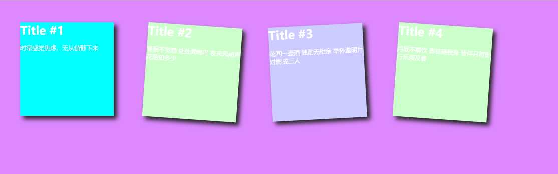
显示效果:
原文:https://www.cnblogs.com/yanyanstyle/p/11417956.html