在flutter中,按钮组件有以下常用属性:
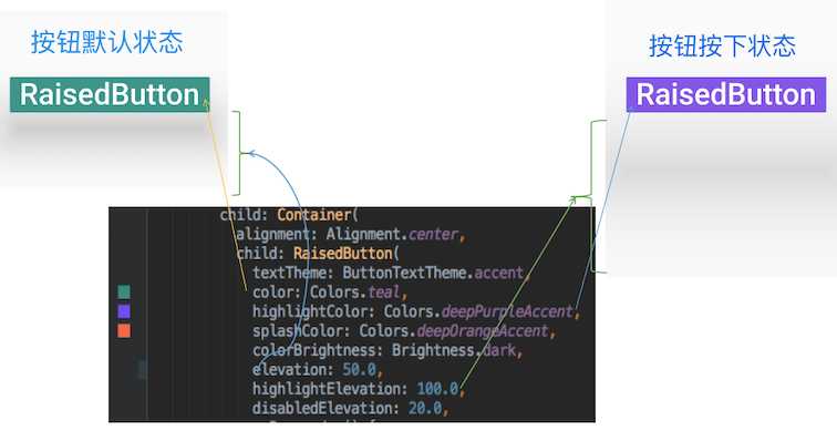
RaisedButton({
    Key key,
  //点击按钮的回调出发事件
    @required VoidCallback onPressed,
  //水波纹高亮变化回调
    ValueChanged<bool> onHighlightChanged,
  //按钮的样式(文字颜色、按钮的最小大小,内边距以及shape)[ Used with [ButtonTheme] and [ButtonThemeData] to define a button‘s base
//colors, and the defaults for the button‘s minimum size, internal padding,and shape.]
    ButtonTextTheme textTheme,
    //文字颜色
    Color textColor,
    //按钮被禁用时的文字颜色
    Color disabledTextColor,
    //按钮的颜色
    Color color,
    //按钮被禁用时的颜色
    Color disabledColor,
    //按钮的水波纹亮起的颜色
    Color highlightColor,
    //水波纹的颜色
    Color splashColor,
    //按钮主题高亮
    Brightness colorBrightness,
    //按钮下面的阴影长度
    double elevation,
    //按钮高亮时的下面的阴影长度
    double highlightElevation,
    double disabledElevation,
    EdgeInsetsGeometry padding,
    ShapeBorder shape,
    Clip clipBehavior = Clip.none,
    MaterialTapTargetSize materialTapTargetSize,
    Duration animationDuration,
    Widget child,
  }
RaisedButton(
            textTheme: ButtonTextTheme.accent,
            color: Colors.teal,
            highlightColor: Colors.deepPurpleAccent,
            splashColor: Colors.deepOrangeAccent,
            colorBrightness: Brightness.dark,
            elevation: 50.0,
            highlightElevation: 100.0,
            disabledElevation: 20.0,
            onPressed: () {
              //TODO
            },
            child: Text(
              ‘RaisedButton‘,
              style: TextStyle(color: Colors.white, fontSize: 40),
            ),
          )
FlatButton({
    Key key,
    @required VoidCallback onPressed,
    ValueChanged<bool> onHighlightChanged,
    ButtonTextTheme textTheme,
    Color textColor,
    Color disabledTextColor,
    Color color,
    Color disabledColor,
    Color highlightColor,
    Color splashColor,
    Brightness colorBrightness,
    EdgeInsetsGeometry padding,
    ShapeBorder shape,
    Clip clipBehavior = Clip.none,
    MaterialTapTargetSize materialTapTargetSize,
    @required Widget child,
  })
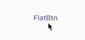
FlatButton(
        onPressed: () {},
        child: Text(
          "FlatBtn",
          style: TextStyle(fontSize: 20, color: Colors.deepPurple),
 ));
const OutlineButton({
    Key key,
    @required VoidCallback onPressed,
    ButtonTextTheme textTheme,
    Color textColor,
    Color disabledTextColor,
    Color color,
    Color focusColor,
    Color hoverColor,
    Color highlightColor,
    Color splashColor,
    double highlightElevation,
    this.borderSide,
    this.disabledBorderColor,
    this.highlightedBorderColor,
    EdgeInsetsGeometry padding,
    ShapeBorder shape,
    Clip clipBehavior,
    FocusNode focusNode,
    Widget child,
  }) : assert(highlightElevation == null || highlightElevation >= 0.0),
       super(
         key: key,
         onPressed: onPressed,
         textTheme: textTheme,
         textColor: textColor,
         disabledTextColor: disabledTextColor,
         color: color,
         focusColor: focusColor,
         hoverColor: hoverColor,
         highlightColor: highlightColor,
         splashColor: splashColor,
         highlightElevation: highlightElevation,
         padding: padding,
         shape: shape,
         clipBehavior: clipBehavior,
         focusNode: focusNode,
         child: child,
       );
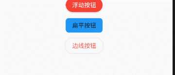
/*带边线的按钮*/
class outlineBtn extends StatelessWidget {
  _log() {
    print("点击了边线按钮");
  }

  @override
  Widget build(BuildContext context) {
    // TODO: implement build
    return OutlineButton(
      onPressed: _log,
      child: Text("边线按钮"),
      textColor: Colors.red,
      splashColor: Colors.green,
      highlightColor: Colors.black,
      shape: BeveledRectangleBorder(
        side: BorderSide(
          color: Colors.red,
          width: 1,
        ),
        borderRadius: BorderRadius.circular(10),
      ),
    );
  }
}
IconButton({
//这几个属性跟前面讲的几个差不多,这里就不再讲了。如有疑问,请留言。
    Key key,
    this.iconSize = 24.0,
    this.padding = const EdgeInsets.all(8.0),
    this.alignment = Alignment.center,
    @required this.icon,
    this.color,
    this.highlightColor,
    this.splashColor,
    this.disabledColor,
    @required this.onPressed,
    this.tooltip
  })

const ButtonBar({
    Key key,
//子组件的间隔样式
    this.alignment = MainAxisAlignment.end,
    this.mainAxisSize = MainAxisSize.max,
//子children
    this.children = const <Widget>[],
  })
code
class FlutterButtonBar extends StatelessWidget {
  @override
  Widget build(BuildContext context) {
    return ButtonBar(children: <Widget>[
      Text("ButtonBar0"),
      Icon(Icons.ac_unit),
      Text("ButtonBar1")
    ], );
  }
}
效果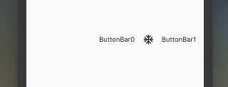
FloatingActionButton({
    Key key,
    //  按钮上的组件,可以是Text、icon, etc.
    this.child,
    //长按提示
    this.tooltip,
    // child的颜色(尽在child没有设置颜色时生效)
    this.foregroundColor,
    //背景色,也就是悬浮按键的颜色
    this.backgroundColor,
    this.heroTag = const _DefaultHeroTag(),
    //阴影长度
    this.elevation = 6.0,
    //高亮时阴影长度
    this.highlightElevation = 12.0,
    //按下事件回调
    @required this.onPressed,
    //是小图标还是大图标
    this.mini = false,
    //按钮的形状(例如:矩形Border,圆形图标CircleBorder)
    this.shape = const CircleBorder(),
    this.clipBehavior = Clip.none,
    this.materialTapTargetSize,
    this.isExtended = false,
  })
FloatingActionButton(
      child: Icon(Icons.access_alarm),
      tooltip: "ToolTip",
      foregroundColor: Colors.white,
      backgroundColor: Colors.deepPurple,
      shape: const Border(),
      onPressed: () {
        //click callback
      },
    )
原文:https://www.cnblogs.com/lxlx1798/p/11061175.html