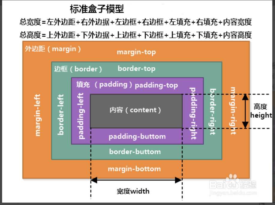
一、CCS盒子模型
<!DOCTYPE html>
<html lang="en">
<head>
    <meta charset="UTF-8">
    <title>盒子模型</title>
</head>
<style>
    body {
        margin: 0;
    }
    .c1 {
        border: black 1px solid;
        width: 100px;
        height: 100px;
        margin-left: 50px;
        margin-top: 25px;
        background-color: tomato;
    }
    .c2 {
        border: black 1px solid;
        width: 100px;
        height: 100px;
        margin-top: 25px;
        margin-left: 50px;
        background-color: blue;
    }
    .c3 {
    border: black 1px solid;
    width: 50px;
    height: 50px;
    margin-left: 20px;
    margin-top: 20px;
    background-color: greenyellow;
    }
</style>
<body>
<div class="c1">
    <div class="c3"></div>
</div>
<div class="c2"></div>
</body>
</html>
标签与标签之间的margin是相对的,它的上下左右有时候只能有2处可以确定,另外2边由于没有参照不会有间隔,所以使用时候一般不会全部上下左右都写上。要表示那一边就写上那一边。
div {
  padding-top: 10px;
  padding-right: 20px;
  padding-bottom: 30px;
  padding-left: 40px;
}

可以简写:padding: 10px 20px 30px 40px

顺序:上右下左

padding的常用简写方式有:

提供一个,用于四边;
提供两个,第一个用于上-下,第二个用于左-右;
如果提供三个,第一个用于上,第二个用于左-右,第三个用于下;
提供四个参数值,将按上-右-下-左的顺序作用于四边;
二、浮动(只要涉及到页面布局,都会用到浮动):
float: left;      /*以左边缘为参考浮动*/
float: right;    /*以右边缘为参考浮动*/
float: none;    /*默认值,不浮动*/
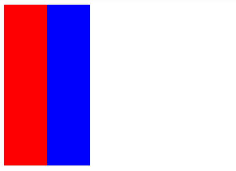
<!DOCTYPE html>
<html lang="en">
<head>
    <meta charset="UTF-8">
    <title>浮动</title>
    <style>
        .c1 {
            width: 80px;
            height: 300px;
            background-color: red;
            float: left;
        }
        .c2 {
            width: 80px;
            height: 300px;
            background-color: blue;
            float: left;
        }
    </style>
</head>
<body>
    <div class="c1"></div>
    <div class="c2"></div>
</body>
</html>
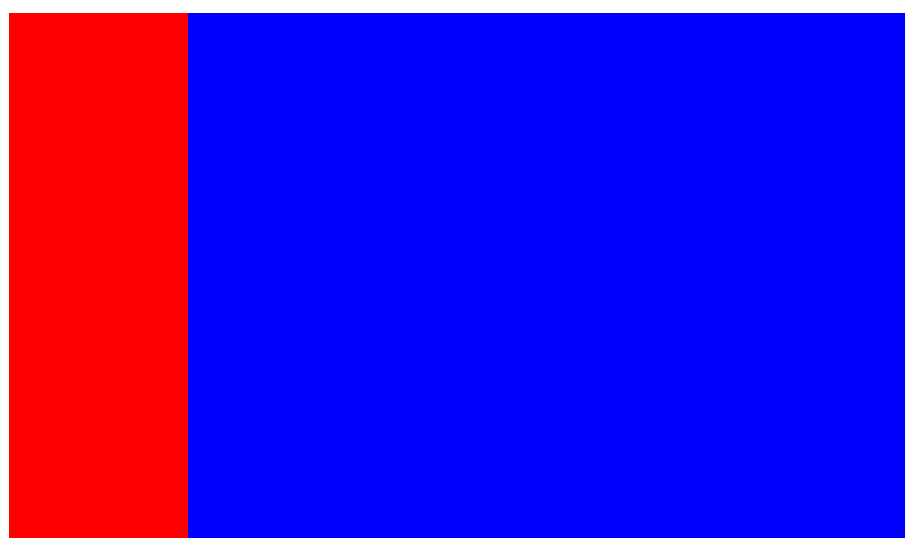
    浮动的时候,如果是2个div占用一行,可以将宽度width用百分比的形式设置,填充一整行。

  <style>
        .c1 {
            width: 20%;
            height: 300px;
            background-color: red;
            float: left;
        }
        .c2 {
            width: 80%;
            height: 300px;
            background-color: blue;
            float: left;
        }
    </style>
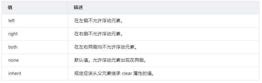
三、清除 clear属性规定标签的那一侧不允许其他浮动标签
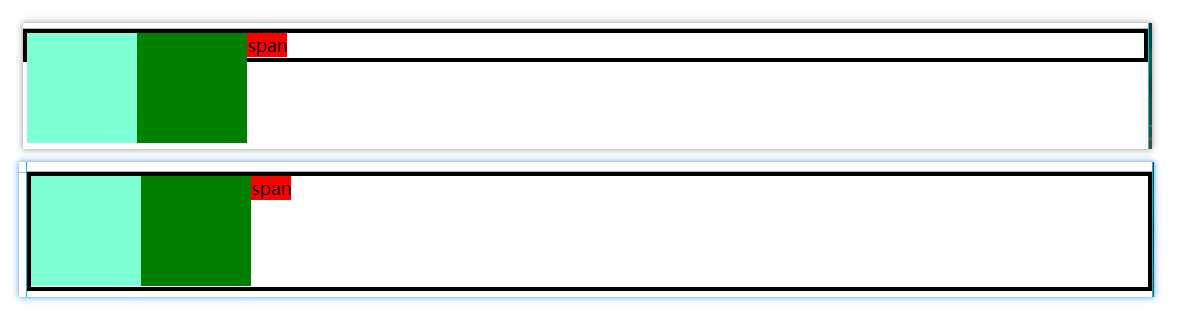
<!DOCTYPE html>
<html lang="en">
<head>
    <meta charset="UTF-8">
    <title>影响</title>
</head>
<style>
    body {margin: 0;
        }
    .clearfix:after {
        content: ‘‘;
        clear: both;
        display: block;
    }
    .c1 {
        border: 4px black solid;
        }
    .c2 {
        width: 100px;
        height: 100px;
        float: left;
        background-color: aquamarine;
    }
    .c3 {
        width: 100px;
        height: 100px;
        float: left;
        background-color: green;
    }
    .c4 {
        background-color: red;
    }

</style>
<body>
<div class="c1 clearfix">
    <span class="c4">span</span>
    <div class="c2"></div>
    <div class="c3"></div>
</div>
</body>
</html>
下面是清除前与清除后的截图:
四、溢出(overflow)
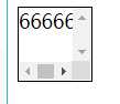
overflow(水平和垂直均设置)
overflow-x(设置水平方向)
overflow-y(设置垂直方向)

<!DOCTYPE html>
<html lang="en">
<head>
    <meta charset="UTF-8">
    <title>溢出</title>
</head>
<style>
    div {width: 60px;
    height: 60px;
        border: black solid 1px;
        /*overflow: hidden; !*隐藏*!*/
        /*overflow: scroll;  !*水平滚动*!*/
        overflow: scroll;
    }
</style>
<body>
<div>66666666666666666</div>
</body>
</html>
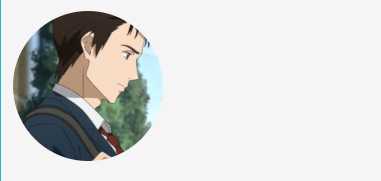
<!DOCTYPE html>
<html lang="en">
<head>
    <meta charset="UTF-8">
    <title>头像</title>
</head>
<style>
    body {
        background-color: whitesmoke;
    }
    /*img {*/
        /*width: 100px;*/
        /*height: 100px;*/
        /*border: red 1px dashed;*/
        /*border-radius: 50%;*/
    /*}*/
    .c1 {
        width: 100px;
        height: 100px;
        /*border: red 1px dashed;*/
        border-radius: 50%;
        overflow: hidden;
    }
    img {
        width: 100%;
    }
</style>
<body>
<div class="c1">
    <img src="泉新一.png" alt="">
</div>
</body>
</html>
五、定位(position) (通过某一相对位置或者绝对的位置将标签定在某一个位置)
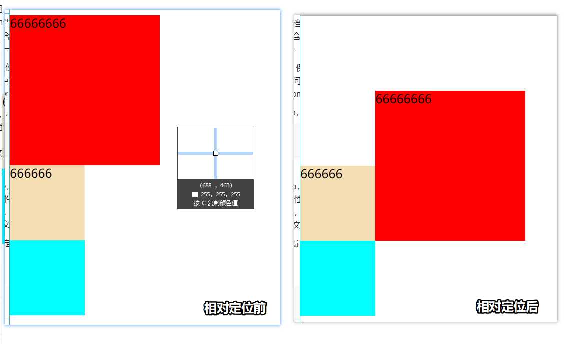
相对定位是相对于该元素在文档流中的原始位置,即以自己原始位置为参照物。有趣的是,即使设定了元素的相对定位以及偏移值,元素还占有着原来的位置,即占据文档流空间。对象遵循正常文档流,但将依据top,right,bottom,left等属性在正常文档流中偏移位置。而其层叠通过z-index属性定义。
注意:position:relative的一个主要用法:方便绝对定位元素找到参照物。
<!DOCTYPE html>
<html lang="en">
<head>
    <meta charset="UTF-8">
    <title>相对定位</title>
    <style>
        body {margin: 0}
        .c1 {
            width: 200px;
            height: 200px;
            background-color: red;
            left: 100px;
            top: 100px;
            position: relative;
        }
        .c2 {
            width: 100px;
            height: 100px;
            background-color: wheat;

        }
        .c3 {
            width: 100px;
            height: 100px;
            background-color: aqua;

        }
    </style>
    <!--相对移动,不脱离文档流,也就是标签移动后,原来的位置还保留着,-->
    <!--不会有其他的标签填补。-->

</head>
<body>
<div class="c1">66666666</div>
<div class="c2">666666</div>
<div class="c3"></div>

</body>
</html>
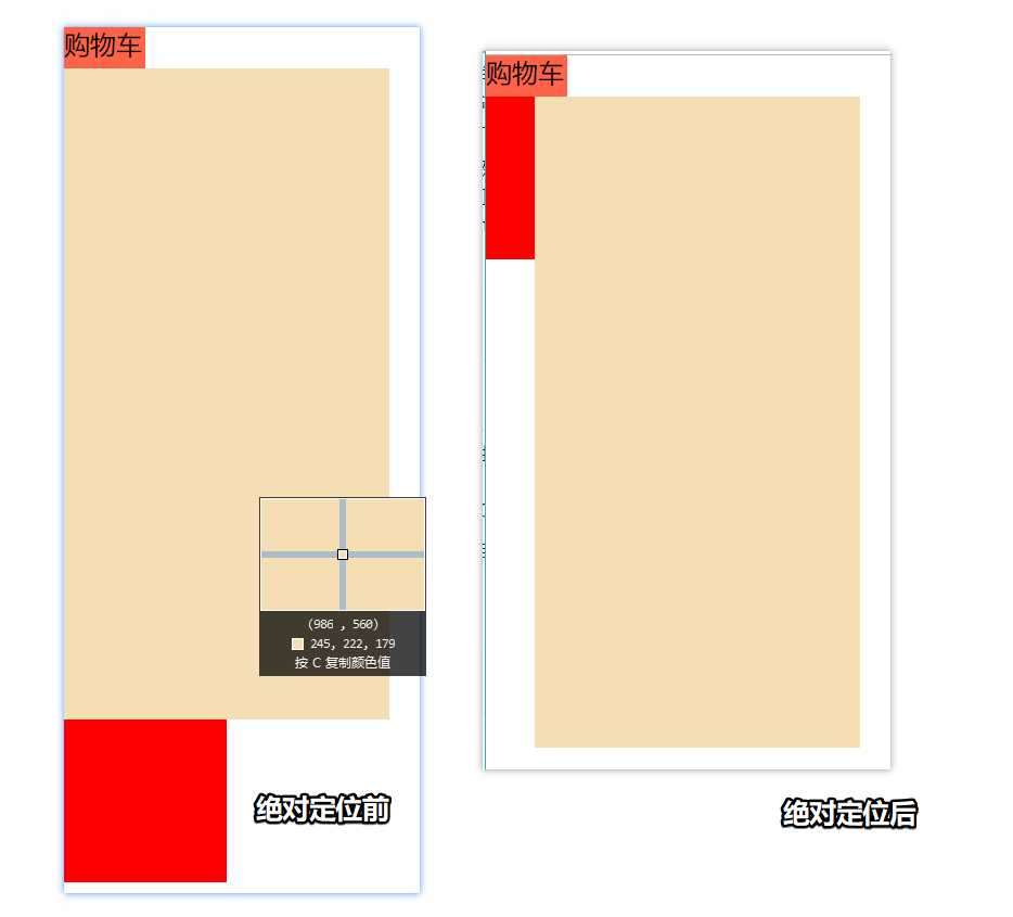
定义:设置为绝对定位的元素框从文档流完全删除,并相对于最近的已定位祖先元素定位,如果元素没有已定位的祖先元素,那么它的位置相对于最初的包含块(即body元素)。元素原先在正常文档流中所占的空间会关闭,就好像该元素原来不存在一样。元素定位后生成一个块级框,而不论原来它在正常流中生成何种类型的框。
重点:如果父级设置了position属性,例如position:relative;,那么子元素就会以父级的左上角为原始点进行定位。这样能很好的解决自适应网站的标签偏离问题,即父级为自适应的,那我子元素就设置position:absolute;父元素设置position:relative;,然后Top、Right、Bottom、Left用百分比宽度表示。
另外,对象脱离正常文档流,使用top,right,bottom,left等属性进行绝对定位。而其层叠通过z-index属性定义。
<!DOCTYPE html>
<html lang="en">
<head>
    <meta charset="UTF-8">
    <title>绝对定位</title>
</head>
<style>
    body {margin: 0}
    .c1 {
        width: 50px;
        height: 25px;
        background-color: tomato;
        position: relative;
    }
    .c2 {
        width: 200px;
        height: 400px;
        background-color: wheat;
        left: 30px;
        top: 25px;
        position: absolute;
    }
    绝对定位,不脱离文档流,移动之后原位置会被占用。
    .c3 {
        width: 100px;
        height: 100px;
        background-color: red;
    }
</style>
<body>
<div class="c1">购物车</div>
<div class="c2"></div>
<div class="c3"></div>
</body>
</html>
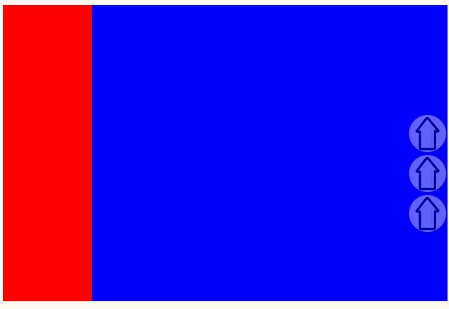
fixed:对象脱离正常文档流,使用top,right,bottom,left等属性以窗口为参考点进行定位,当出现滚动条时,对象不会随着滚动。而其层叠通过z-index属性 定义。 注意点: 一个元素若设置了 position:absolute | fixed; 则该元素就不能设置float。这 是一个常识性的知识点,因为这是两个不同的流,一个是浮动流,另一个是“定位流”。但是 relative 却可以。因为它原本所占的空间仍然占据文档流。
在理论上,被设置为fixed的元素会被定位于浏览器窗口的一个指定坐标,不论窗口是否滚动,它都会固定在这个位置。
<!DOCTYPE html>
<html lang="en">
<head>
    <meta charset="UTF-8">
    <title>固定定位</title>
</head>
<style>
    a {
        text-decoration: none;
    }
    .c3 {
        width: 50px;
        height: 150px;
        background-color: rgba(0,0,0,0);
        bottom: 50%;
        right: 10px;
        position: fixed;
    }
    body {
        background-color: floralwhite;
    }
    .c1 {
        width: 20%;
        height: 400px;
        background-color: red;
        float: left;

    }
    .c2 {
        width: 80%;
        height: 400px;
        background-color: blue;
        float: right;
    }
    [xxx] {
        width: 100%;
        border-radius: 50%;
        opacity: 0.4
    }
</style>
<body>
    <div class="c1"></div>
    <div class="c2"></div>
    <div class="c3">
        <a href="#">
            <img src="up.jpg" alt="" title="返回顶部" xxx>
        </a>
        <a href="#">
            <img src="up.jpg" alt="" title="返回顶部" xxx>
        </a>
        <a href="#">
            <img src="up.jpg" alt="" title="返回顶部" xxx>
        </a>
    </div>
</body>
</html>
六、模态框(z-index)
设置对象的层叠顺序。
<!DOCTYPE html>
<html lang="en">
<head>
    <meta charset="UTF-8">
    <title>模态框</title>
</head>
<style>
    body {margin: 0}
    .c1 {
        position: fixed;
        top: 0;
        bottom: 0;
        left: 0;
        right: 0;
        background-color: rgba(128,128,128,0.5);
        z-index: 10;

    }
    .c2 {
        z-index: 15;
        width: 300px;
        height: 100px;
        background-color: tomato;
        position: fixed;
        left: 50%;
        margin-left: -150px;
        top: 50%;
        margin-top: -50px;
        opacity: 0.8;

    }
    .c3 {

    }

</style>
<body>
<div class="c1">今天天气真好!</div>
<div class="c2"></div>
<div class="c3"></div>
</body>
</html>
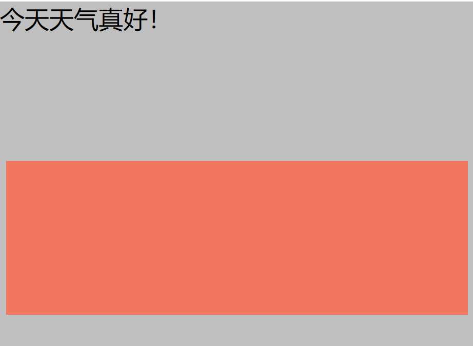
成色在最上面,灰色界面在中间,文字在最下面。
七、rgba 与 opacity
补充:简单网页页面的搭建:(暂未使用JS)

个人代码交流:

OCTYPE html>
<html lang="en">
<head>
    <meta charset="UTF-8">
    <title>苏光体的页面</title>
    <link rel="stylesheet" href="sgt.css">
</head>
<body>

<!--侧边开始-->
<div class="sidebar">
    <a href="#"><img src="up.jpg" title="回到顶部"></a>
    <a href="#bottom"><img src="down1.jpg" title="回到顶部"></a>
</div>
<!--侧边开始-->

<!--左边开始-->
<div class="b_left">
    <div class="head_img">
        <img src="泉新一.png" alt="">
    </div>
    <div class="b_title">萌新的港湾</div>
    <div class="b_info">硬核玩家,赞美太阳</div>
    <div class="b_contact">
        <ul>
            <li>关于我</li>
            <li><a href="https://www.cnblogs.com/suguangti/" target="_blank">博客园</a></li>
            <li>微信公众号</li>
        </ul>
    </div>
    <div class="b_skill">
        <ul>
            <li>#Python</li>
            <li>#Java</li>
            <li>#Go</li>
        </ul>
    </div>
</div>
<!--左边结束-->

<!--右边开始-->
<div class="b_all_right">
    <div class="b_right">
        <div class="content_1">
            <span>老男孩带你走向人生癫疯!</span>
            <span class="content_1_1">2019-05-30</span>
        </div>
        <div class="content_2">
            哪有什么天生如此,只是我们天天坚持!
        </div>
        <div class="content_3">
            <span>☆坚持</span>
            <span class="content_3_1">☆努力</span>
        </div>
    </div>
</div>
<!--右边结束-->
<a href="" id="bottom"></a>
</body>
</html>
/*通用设置*/
body {margin: 0;
    background-image: url("dm.jpg");
    background-size: 100%;
    background-attachment: fixed;
}
ul {list-style-type: none;
    padding-left: 0;
    }
a {text-decoration: none
}
.sidebar {
    width: 50px;
    height: 150px;
    opacity: 0.4;
    bottom: 30%;
    right: 2px;
    position: fixed;
}


/*左部分设置*/
.b_left {
    position: fixed;
    width: 20%;
    height: 100%;
    background: rgba(76, 76, 76,0.7);
    float: left;
    text-align: center;
}
.head_img {
    width: 120px;
    height: 120px;
    border-radius: 50%;
    overflow: hidden;
    margin: 25px auto;
}
img {
    width: 100%;
}
.b_title {
    font-family: 华文隶书;
    font-size: 24px;
    color: crimson;

}
.b_info {
    font-family: 华文行楷;
    font-size: 20px;
    color: white;
    margin-top: 10px;
}
.b_contact {
    font-family: 华文隶书;
    color: whitesmoke;
    font-size: 18px;
    margin-top: 50px;
}
.b_skill {
    font-family: "Times New Roman";
    color: black;
    font-size: 18px;
    margin-top: 50px;
}
/*右部分设置*/
.b_all_right {
    width: 80%;
    background: rgba(220,255,255,0.5);
    float: right;

}
.b_right {
    width: 96%;
    background: rgba(255,255,255,0.6);
    margin-left: 8px;
    margin-top: 10px;
    box-shadow: 10px 10px 10px rgba(0,0,0,0.8);

}
.content_1 {
    border-left: red 8px solid;
    margin-bottom: 10px;
    font-size: 36px;
    font-family: 华文隶书;
    text-indent: 12px;
}
.content_1_1 {
    float: right;
    margin-right: 10px;
}
.content_2 {
    font-family: 华文行楷;
    font-size: 22px;
    text-indent: 22px;
    margin-bottom: 6px;
    border-bottom: black 1px solid;
    padding-bottom: 4px;
}
.content_3 {
    font-family: 新宋体;
    font-size: 20px;
    text-indent: 22px;
    padding-bottom: 4px;
}
.content_3_1 {
    margin-left: 30px;
}
原文:https://www.cnblogs.com/suguangti/p/10952998.html
