HTML代码:
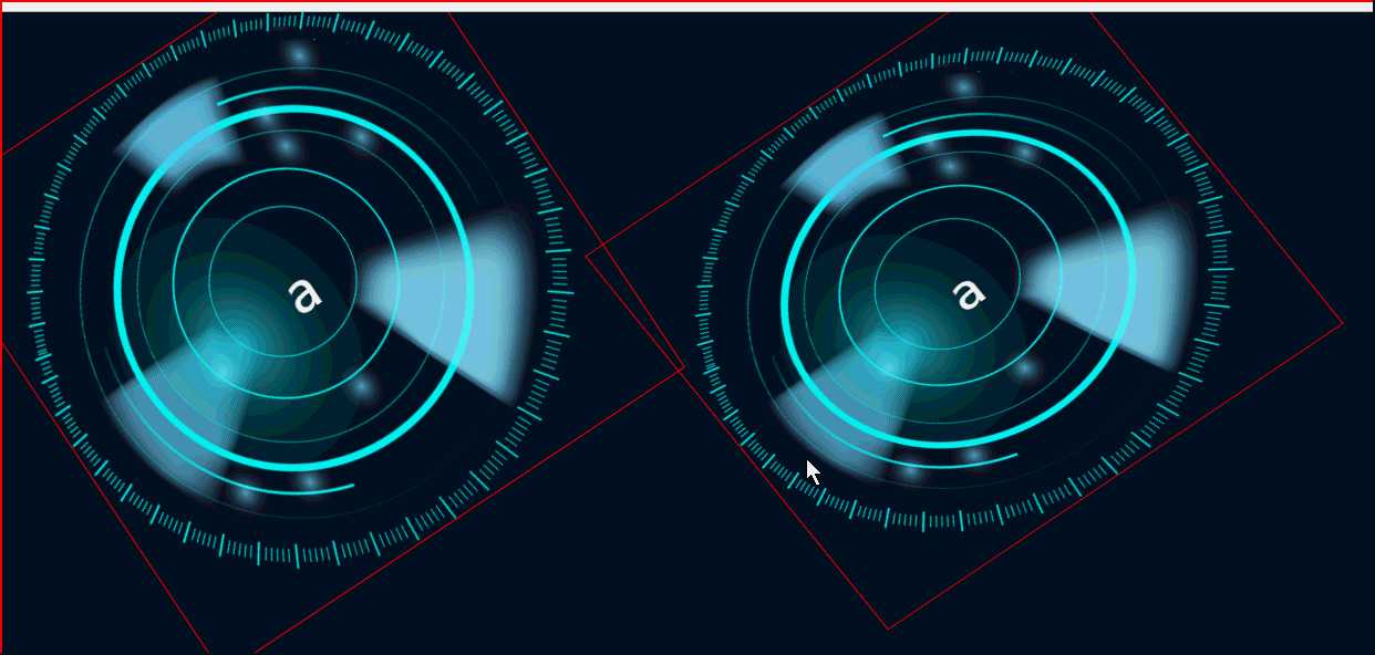
<div class="r-1">a</div>
<div class="r-2">a</div>
CSS代码:
        .r-1{
            border: 1px solid red;
            text-align: center;color: #ffffff;line-height: 500px;vertical-align: middle;font-size: 50px;;
            position: absolute;
            width: 500px;height: 500px;
            top:0px;left:620px;
            background-image: url("resoureces/a.png");
            background-size: 100% 100%;
            background-repeat: no-repeat;

            animation: circleSmall 10s linear infinite;
        }

.r-2{
    border: 1px solid red;
    text-align: center;color: #ffffff;line-height: 500px;vertical-align: middle;font-size: 50px;;
    position: absolute;
    width: 500px;height: 500px;
    top:0px;left:20px;
    background-image: url("resoureces/a.png");
    background-size: 100% 100%;
    background-repeat: no-repeat;

    animation: circleSmall2 10s linear infinite;
}
        /*旋转动画*/

        @-webkit-keyframes circleSmall{

            0%{
                transform: rotateX(30deg) rotateY(-10deg) rotateZ(0deg);
            }
            100%{
                transform: rotateX(30deg) rotateY(-10deg) rotateZ(360deg);
            }
        }

@-webkit-keyframes circleSmall2{
     0% {
         -webkit-transform: rotate3d(0,0,.2,0deg);
     }

     100% {
         -webkit-transform: rotate3d(0,0,.2,360deg);
     }
}
原文:https://www.cnblogs.com/pangchunlei/p/10830356.html