官方文档:http://www.w3school.com.cn/cssref/index.asp
开始之前先说下我准备的案例:https://github.com/lotapp/h5blog/
这次是真费了一番功法去准备了一个博客的案例,从
设计(布局是仿几个模版的)到PC页面、再到响应式移动端布局(本来是准备直接出移动页面的,后来一想,算了彻底点吧,含iPad和iPhone)、再到移动端H5页面、最后再到小程序页面(在H5的基础上简单改了下)算是都弄了个demo
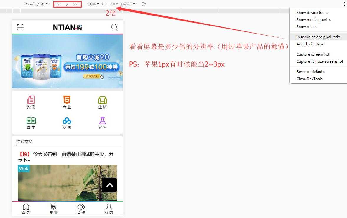
先贴下效果图,可能你才有看的动力(前端真的没啥,忘了W3C查一下,我这边整理一下也是为了以后方便)
PC端演示:https://github.lesschina.com/html5/
这个动态演示的gif太大,大家自己访问吧,这边就贴一个静态图
ipad布局:GIF渲染的时候有点小问题,可以直接访问查看效果

iPhone:GIF渲染的时候有点小问题,可以直接访问查看效果

移动端演示:http://github.lesschina.com/html5/mobil/

微信端演示:https://github.com/lotapp/H5Blog/tree/master/wechat

注意下图片有时候会有黑边框的问题,设置一下display:block就可以了
PS:本质就是行内块间隙问题(后面会说的)
小程序方面注意点:
navigator)是块级元素,而a标签本来是行内元素image)在css中设置width:100%是有点小问题的,还需要设置mode="widthFix"(或者直接设置这个)基础简单过下,事先说明下:诸如引入、注释、案例就不一一演示了,有个工作1年左右的人都可以熟练掌握,所以基础部分就简单归纳一下W3C的常用属性列表了
官方文档:http://www.w3school.com.cn/cssref/index.asp#font or http://www.w3school.com.cn/cssref/index.asp#text
color:文字的颜色
color:red;、color: #000;、color: rgb(0,0,0);font-size:文字的大小
font-size:12px;font-family:文字的字体
font-family:‘Microsoft Yahei‘;font-style:字体是否倾斜
font-style:normal;i、em这些会导致字体倾斜的标签设置font-weight:文字是否加粗
font-weight:bold;、字体不加粗:font-weight:normal;**line-height**:文字的行高
line-height:24px;2~6汇总设置:font:同时设置文字的几个属性
font:是否加粗 字号/行高 字体;font:normal 12px/36px ‘Microsoft Yahei‘;text-align:文字水平对齐方式
text-align:centerlist-style-type:设置列表项标记符号
list-style-type:none;text-decoration:文字下划线
text-decoration:none;a的下划线text-indent:文字首行缩进
text-indent:2em;text-transform:控制文本的大小写
none:定义带有小写字母和大写字母的标准的文本(默认)capitalize:单词中首字母大写uppercase:单词大写lowercase:单词小写官方文档:http://www.w3school.com.cn/cssref/index.asp#background
background:汇总2~6
background: 颜色 url(背景图) no-repeat 定位 fixedbackground:url(雪碧图) no-repeat left -3.025rem;background-color:设置元素的背景颜色background-image:设置元素的背景图像background-repeat:设置是否及如何重复背景图像background-position:设置背景图像的开始位置
background-position: center center;background-attachment:设置背景图像是否固定或者随着页面的其余部分滚动普通盒子宽 | 高 = width | height + padding + border
官方文档:http://www.w3school.com.cn/cssref/index.asp#dimension
width:宽度height:高度max-width:最大宽度max-height:最大高度min-height:最小高度min-width:最小宽度官方文档:http://www.w3school.com.cn/cssref/index.asp#border
border:2~4汇总
border:width style color;border:10px solid red;border-width:设置四条边框的宽度border-style:设置四条边框的样式
solid:实线、dashed:虚线、dotted:点线border-color:设置四条边框的颜色PS:指定边框样式:border-[top|left|right|bottom]:width style color;
border-top: #00c1de .2rem solid;官方文档:http://www.w3school.com.cn/cssref/index.asp#positioning
浮动本身没什么知识点,清除浮动倒是可以说下:
float: none;:不浮动(默认值)float: left;:左浮动float: right;:右浮动clear: both;:清除所有浮动
[left | right | both |none]以前清除浮动都是在浮动div下添加一个div.clear的空白div,现在基本上都是用淘宝的伪元素大法:
PS:有利于SEO
/* 清除浮动的样式 */
.clearfix::before,
.clearfix::after {
  content: '';
  display: table;
}

.clearfix::after {
  clear: both;
}

/* 兼容IE */
.clearfix {
  zoom: 1;
}overflow:元素溢出
清除浮动、解决margin-top塌陷问题PS:如果只只对一个方向可以使用overflow-x | overflow-y
main{position:absolute;left:0;right:0;top:2.5rem;bottom:2.5rem;overflow-x:hidden;overflow-y:auto;}position:定位
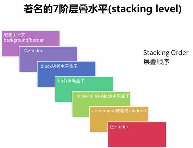
absolute:绝对定位fixed:固定定位relative:相对定位static:没有定位(默认值)position使用)
top:距离上方的距离left:距离左方的距离right:距离右方的距离bottom:距离下方的距离z-index
PS:绝对定位和固定定位的块元素和行内元素会自动转化为行内块元素
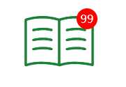
来个经常使用的案例:
<!DOCTYPE html>
<html>
<head>
    <meta charset="UTF-8">
    <title>定位案例</title>
    <link rel="stylesheet" href="https://at.alicdn.com/t/font_1148101_h5fe3ssorlk.css">
    <style>
        header {
            width: 100px;
            margin: 0 auto;
            text-align: center;
        }
        /* 字体图标 */
        header a.icon-guoxue {
            /* 去除下划线 */
            text-decoration: none;
            color: #1a8236;
            font-size: 100px;
            /* 父类元素设置相对|绝对定位 */
            position: relative;
        }
        header span {
            position: absolute;
            top: 15px;
            right: -5px;
            /* 绝对定位和固定定位的块元素和行内元素会自动转化为行内块元素 */
            width: 30px;
            height: 30px;
            font-size: 16px;
            /* 居中显示 */
            line-height: 30px;
            color: white;
            background-color: red;
            /* 变成圆 */
            border-radius: 50%;
        }
    </style>
</head>
<body>
    <!-- a.iconfont.icon-guoxue>span{99} -->
    <header>
        <a href="#" class="iconfont icon-guoxue"><span>99</span></a>
    </header>
</body>
</html>
效果:
官方文档:http://www.w3school.com.cn/cssref/index.asp#padding
padding:汇总属性
padding:上 右 下 左;padding: 上 左右 下;padding-bottom:设置元素的下内边距padding-left:设置元素的左内边距padding-right:设置元素的右内边距padding-top:设置元素的上内边距官方文档:http://www.w3school.com.cn/cssref/index.asp#margin
margin:汇总属性
margin:x auto;margin:上 右 下 左;、三个值:margin: 上 左右 下;margin-bottom:设置元素的下外边距margin-left:设置元素的左外边距margin-right:设置元素的右外边距margin-top:设置元素的上外边距PS:有时候有margin-top塌陷和外边距合并的问题,so ==> 尽量用padding
重现:在两个盒子嵌套时候,内部的盒子设置的margin-top会加到外边的盒子上,导致内部的盒子margin-top设置失败
解决:外部盒子设置一个边框,并且在外部盒子里设置overflow:hidden,最后使用伪元素.clearfix:before{content: ‘‘;display:table;}
width、height、margin和padding
用代码表示一下:
display:inline:内联元素(默认)
display:block:块级元素
display:inline-block:行内块元素隐藏:display:none此元素不会显示也不占空间,visibility:hidden;元素是否可见且占空间
PS:加过渡动画的时候,visibility有动画效果,而display没有
以前是只要不去换行就没事了(去掉内联元素之间的换行),现在get到一个新skill:
cursor:pointer;white-space: nowrap;(normal是默认值)
border-collapse:collapse;(现在基本上用不到了)选择器参考手册:http://www.w3school.com.cn/cssref/css_selectors.asp
p{color:red;}#footer{color:#a7a8a9;}.copyright {text-align: center;}空格间隔)
.copyright a{color: #a7a8a9;}:设置copyright类下的a标签颜色em,i {font-style: normal;}:去除em和i的斜体样式伪类|伪元素选择器:两个:就是伪元素
nav li:hover {color: #000;}.clearfix::after {content:‘‘;display:table;clear:both;}:清除浮动:伪类(一种选择器)eg::hover、a:active、a:visited::伪元素(通过CSS实现的页面元素)eg:::before、::after/* 常用伪类 */
a:link {color: #FF0000} /* 未访问的链接 */
a:visited {color: #00FF00} /* 已访问的链接 */
a:hover {color: #FF00FF} /* 鼠标移动到链接上 */
a:active {color: #0000FF} /* 选定的链接 */参考文档:http://www.w3school.com.cn/css/css_syntax_attribute_selector.asp
以前就有的:表单用的比较多些
[属性名] {}:匹配对应的属性即可[属性名=值] {}:匹配属性名是某值[属性名|=值](属性名以某值开头)和[属性名~=值](属性名包含某值)CSS3新增:结合爬虫有大用
[属性名^=值] {}:以值开头
a[src^="https"]:选择src属性以https开头的每个<a>元素[属性名$=值] {}:以值结束
a[src$=".pdf"]:选择src属性以.pdf结尾的所有<a>元素[属性名*=值] {}:包含某值
a[src*="baidu.com"]:选择src属性包含baidu.com子串的每个<a>元素来个简单案例:
<!DOCTYPE html>
<html>
<head>
    <meta charset="UTF-8">
    <title>属性选择器</title>
    <style>
        input[type="password"] {
            background-color: yellow;
        }
        // name以user开头的表单(eg:用户相关字段)
        input[name^="user"] {
            background-color: green;
        }
    </style>
</head>
<body>
    <input type="hidden" name="id"><br/>
    <input type="text" name="user_name"><br/>
    <input type="text" name="user_age"><br/>
    <input type="password" name="pass">
</body>
</html>
效果:
结构性伪类选择器:n可以是数值也可以是表达式(eg:2n+1)
:nth-child(n) {}:选中父元素中正数第n个子元素
:first-child {}:选中父元素中第一个子元素:nth-last-child(n) {}:选中父元素中倒数第n个子元素
:last-child {}:选中父元素中最后一个子元素:nth-of-type(n){}:选中父元素中特定正数第n个子元素
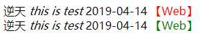
:nth-last-child(n) {}:选中父元素特定元素中倒数第n个子元素这个看一个必须来个案例:
<!DOCTYPE html>
<html>
<head>
    <meta charset="UTF-8">
    <title>结构性伪类选择器</title>
    <style>
        /* 本意先找到bloginfo类下的第一个div,对它第二个span设置样式 */

        /* 浏览器会这么找:先去bloginfo类下的第一个div中找第二个元素,然后看看是不是span,如果是则生效 */
        /* PS:这边父类下第二个元素不是span,所以不生效 */
        .bloginfo div:first-child span:nth-child(2) {
            color: red;
        }

        /* 如果需要达到这个效果可以这么用: */
        .bloginfo div:first-child span:nth-child(4) {
            color: red;
        }

        /* 本意先找到bloginfo类下的第二个div,对它第二个span设置样式 */

        /* 浏览器会这么找:先去bloginfo类下的第二个div中找所有的span,然后给第二个span设置样式 */
        .bloginfo div:last-child span:nth-of-type(2) {
            color: green;
        }
    </style>
</head>
<body>
    <div class="bloginfo">
        <div>
            <span>逆天</span>
            <i>this is test</i>
            <time>2019-04-14</time>
            <span>【Web】</span>
        </div>
        <!-- 和上面一样 -->
        <div>
            <span>逆天</span>
            <i>this is test</i>
            <time>2019-04-14</time>
            <span>【Web】</span>
        </div>
    </div>
</body>
</html>
输出图示:
:target:被锚链接指向的时候会触发该选择器::selection:当被鼠标选中的时候的样式::first-line:选中第一行::first-letter:选中第一个字符这个官方文档我倒是没找到,但是流传比较多的是这么个顺序(已验)
!important(权重值:10000)加在样式属性值后
display: block!important;内联样式(权重值:1000)
style="xx"ID选择器(权重值:100)
#content{xx}类,伪类和属性选择器(权重值:10)
.clearfix、:hover、input[type="text"]标签选择器和伪元素选择器(权重值:1)
div、p、:before通用选择器(*)、子选择器(>)、相邻选择器(+)、同胞选择器(~)的(权重值:0)
PS:这个平时用不到,但是对于修改模版样式不生效的时候经常会用到
你有没有发现有些样式修改了并不生效?这时候CSS权重的重要性就来了
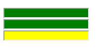
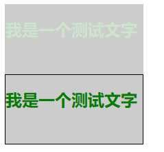
opacity:设置元素整体透明度rgba:设置带透明色的颜色
来个区分案例:
<!DOCTYPE html>
<html>
<head>
    <meta charset="UTF-8">
    <title>透明背景</title>
    <style>
        div {
            width: 200px;
            height: 100px;
            color: green;
            border: 1px solid black;
        }

        div:nth-child(1) {
            background-color: black;
            /* 设置整个div的透明色 */
            opacity: 0.2;
        }

        div:nth-child(2) {
            /* 只设置背景色的透明度 */
            background-color: rgba(0, 0, 0, 0.2);
        }
    </style>
</head>
<body>
    <div>
        <h2>我是一个测试文字</h2>
    </div>
    <div>
        <h2>我是一个测试文字</h2>
    </div>
</body>
</html>
效果:
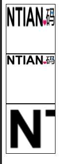
官方案例:http://www.w3school.com.cn/tiy/c.asp?f=css_background-size
background-size:规定背景图片的尺寸
background-size:30% 40%;:可以是数值或百分比
contain:等比缩放,直至宽或者高和盒子相同
cover:等比缩放,并填充慢容器
看个案例:
<!DOCTYPE html>
<html>
<head>
    <meta charset="UTF-8">
    <title>背景尺寸</title>
    <style>
        div {
            width: 100px;
            height: 100px;
            background: url(http://github.lesschina.com/html5/images/logo.gif) no-repeat;
            border: 1px solid black;
        }

        div:nth-child(1) {
            /* 宽 高 */
            background-size: 100% 50%;
        }

        div:nth-child(2) {
            /* 等比缩放,直至宽或者高和盒子相同 */
            background-size: contain;
        }

        div:nth-child(3) {
            /* 等比缩放,并填充慢容器 */
            background-size: cover;
        }
    </style>
</head>
<body>
    <div></div>
    <div></div>
    <div></div>
</body>
</html>
效果图:
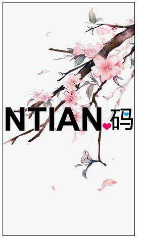
CSS3可以设置两个背景图:background-image:url(xxx),url(xxx);(叠加显示)
看个案例:
<!DOCTYPE html>
<html>
<head>
    <meta charset="UTF-8">
    <title>两个背景图</title>
    <style>
        div {
            width: 260px;
            height: 462px;
            /* 三句合为一句写 */
            background: url(https://github.lesschina.com/html5/images/logo.gif) no-repeat center center, url(https://github.lesschina.com/html5/images/banner/b02.jpg) no-repeat center;
            /* background-image: url(https://github.lesschina.com/html5/images/logo.gif), url(https://github.lesschina.com/html5/images/banner/b02.jpg); */
            /* background-repeat: no-repeat; */
            /* 垂直居中 + 水平居中 */
            /* background-position: center center; */
            border: 1px solid black;
        }
    </style>
</head>
<body>
    <div></div>
</body>
</html>
效果:
background-origin:设置背景图片的定位区域:
padding-box:以内边距(padding)左上角为起点进行定位(默认值)border-box:以边框(border)左上角为起点进行定位content-box:以内容区域(content)左上角为起点background-clip:规定背景的绘制区域
border-box:背景图片在整个容器中显示padding-box:背景图片在内边距+正文区域显示content-box:背景图片只在正文区域显示border-radius:边框圆角border-image:边框图片(eg:border-image:url(border.png) 20 round;)
border-image-source: url("xx");border-image-slice: 数值;
不需要带单位border-image-repeat: 设置边框图片的平铺方式(如何重复图像边框)
stretch:拉伸(默认)round:环绕的方式重复显示repeat:重复显示
border-image-width: 数值;box-shadow: 水平阴影的位置 垂直阴影的位置 [模糊距离] [阴影的尺寸] [阴影的颜色] [内|外阴影];
text-shadow:设置文本阴影box-shadow: 0px 0px 10px #fff;(水平阴影位置,垂直阴影位置,模糊距离,颜色)linear-gradient
to [ right | top | bottom | left ] or 0deg:从下向上渐变],90deg:从左向右linear-gradient(to left top, blue, red);radial-gradient
background-image这个比较简单,简单说下常用的两种即可:
<!DOCTYPE html>
<html>
<head>
<meta charset="UTF-8">
<meta name="viewport" content="width=device-width, initial-scale=1.0, user-scalable=no">
<title>圆角案例</title>
<style>
/* 椭圆矩形 */
div:first-child {
width: 200px;
height: 200px;
background: black;
border-radius: 10px;
}
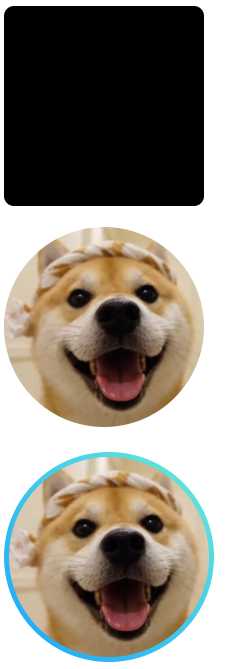
/* 设置图片大小,并显示为圆 */
div img {
/* 半径是长度的50%==>圆 */
border-radius: 50%;
width: 200px;
height: 200px;
}
div:last-child i {
display: block;
width: 200px;
height: 200px;
padding: 5px;
border-radius: 50%;
/* 设置一个渐变色 */
background: linear-gradient(to top right, rgba(0, 153, 255, .9), rgba(42, 228, 197, .7));
}
</style>
</head>
<body>
<div></div><br />
<div><img src="https://github.lesschina.com/html5/images/avatar.jpg"></div><br />
<div><i><img src="https://github.lesschina.com/html5/images/avatar.jpg"></i></div>
</body>
</html>图示:
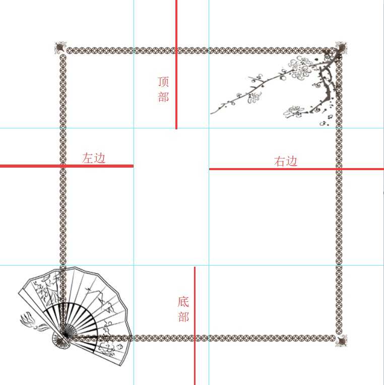
我先用PS来简单扩充一下裁切的概念:(类比Padding和margin的设置方法,然后不算单位)
看个简单案例:(平时设置网站风格的时候用的比较多,以前是设置背景图片,现在省事也省带宽了)
<!DOCTYPE html>
<html>
<head>
<meta charset="UTF-8">
<meta name="viewport" content="width=device-width, initial-scale=1.0, user-scalable=no">
<title>边框图片</title>
<style>
div {
width: 300px;
height: 300px;
border: 50px solid black;
font-family: '钟齐流江毛笔草体';
font-size: 30px;
line-height: 300px;
/* 竖排显示(从左往右方向) */
writing-mode: vertical-lr;
text-align: center;
float: left;
}
div:nth-child(2) {
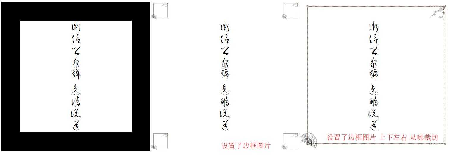
/* 设置边框图片 */
border-image-source: url(../images/1.png);
}
div:nth-child(3) {
border-image: url(../images/1.png) 54 80 62 68;
/* border-image-source: url(../images/1.png); */
/* 设置边框图片的裁切 */
/* border-image-slice: 54 80 62 68; */
}
</style>
</head>
<body>
<div>微信公众号 逸鹏说道</div>
<div>微信公众号 逸鹏说道</div>
<div>微信公众号 逸鹏说道</div>
</body>
</html>图示:
平铺方式简单说下:
<!DOCTYPE html>
<html>
<head>
<meta charset="UTF-8">
<meta name="viewport" content="width=device-width, initial-scale=1.0, user-scalable=no">
<title>边框图片2</title>
<style>
div {
width: 250px;
height: 250px;
margin-right: 20px;
border: 50px solid black;
font-size: 25px;
line-height: 300px;
/* 竖排显示(从左往右方向) */
writing-mode: vertical-lr;
text-align: center;
float: left;
}
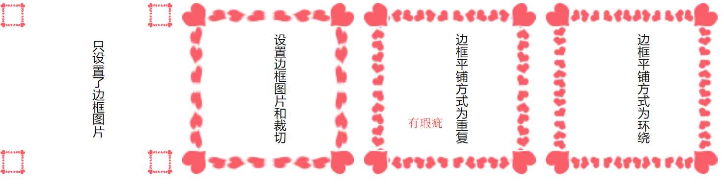
div:first-child {
border-image: url(../images/2.png);
}
div:nth-child(2) {
/* 裁切20就可以把四个角的爱心完美扣下了 */
border-image: url(../images/2.png) 20;
}
div:nth-child(3) {
/* 设置边框图片的平铺方式 */
border-image: url(../images/2.png) 20 repeat;
}
div:last-child {
/* 推荐方式 */
border-image: url(../images/2.png) 20 round;
}
</style>
</head>
<body>
<div>只设置了边框图片</div>
<div>设置边框图片和裁切</div>
<div>边框平铺方式为重复</div>
<div>边框平铺方式为环绕</div>
</body>
</html>图示:
课后拓展:
我的理解:如果一个元素设置了transition,那么它属性改变的时候就会呈现出动画状态
transition: property duration timing-function delay
transition-property:设置过渡的属性
transition-duration:设置过渡的时间
transition-timing-function:设置过渡的运动方式
linear(匀速). ease(缓冲运动)transition-delay:设置动画的延迟
PS:一般都这么用:transition: all 500ms ease;
看个例子:
<!DOCTYPE html>
<html>
<head>
    <meta charset="UTF-8">
    <meta name="viewport" content="width=device-width, initial-scale=1.0, user-scalable=no">
    <title>过渡动画</title>
    <style>
        div {
            width: 300px;
            height: 300px;
            margin: 0 auto;
            background-color: black;
            /* 设置了transition,那div任何属性的改动都会有过渡动画 */
            transition: all 1s ease;
        }

        div:hover {
            background-color: yellow;
        }
    </style>
</head>
<body>
    <div></div>
</body>
</html>
图示:
只有一个属性是没有过渡动画的:display:none ==》 display:block
看个区分案例:
<!DOCTYPE html>
<html>
<head>
    <meta charset="UTF-8">
    <meta name="viewport" content="width=device-width, initial-scale=1.0, user-scalable=no">
    <title>特殊案例</title>
    <style>
        div {
            width: 300px;
            height: 300px;
            margin: 0 auto;
            background-color: black;
            /* 设置了transition,那div任何属性的改动都会有过渡动画 */
            transition: all 500ms ease;
        }
        /* 第一个盒子使用visibility的方式显示和隐藏 */
        div:first-child {
            visibility: hidden;
        }
        body:hover div:first-child {
            visibility: visible;
            background-color: yellow;
        }
        /* 第二个盒子使用display的方式显示和隐藏 */
        div:last-child {
            display: none;
        }
        body:hover div:last-child {
            display: block;
            background-color: yellow;
        }
    </style>
</head>
<body>
    <div>visibility</div>
    <div>display</div>
</body>
</html>图示:(visibility和display的区别不用说了吧?无非是一个占空间一个不占)

经验:如果多个变换一起用的,那么顺序为:从后往前执行**
transform一定要加初始值**(不然在边角的时候有小问题)
transform: translate(x轴,y轴);
transform: translate(100px,100px);transform: scale(x,y);
transform: scale(0.5,1);transform: rotate(60deg);deg是角度transform: skew(x轴,y轴);transform: skew(30deg,30deg);看个案例:
<!DOCTYPE html>
<html>
<head>
    <meta charset="UTF-8">
    <meta name="viewport" content="width=device-width, initial-scale=1.0, user-scalable=no">
    <title>2d变换</title>
    <style>
        div {
            width: 200px;
            height: 200px;
            float: left;
            border: 1px solid black;
            background-color: yellow;
            /* 添加一个过渡动画 */
            transition: all 1s ease;
        }
        /* x轴平移50px,y轴平移100px */
        div:first-child:hover {
            background-color: green;
            /* 逗号别忘记了 */
            transform: translate(50px, 100px);
        }
        /* x轴放大1.1倍,y轴放大2倍 */
        div:nth-child(2):hover {
            transform: scale(1.1, 2)
        }
        /* 旋转90度 */
        div:last-child:hover {
            transform: rotate(90deg)
        }

    </style>
</head>
<body>
    <div></div>
    <div></div>
    <div></div>
</body>
</html>图示:(PS:CSS3样式都不会改变盒模型,这个案例就可以看出了)
这两个是视觉更好体验的参数:(推荐)
transform-style:preserve-3d:允许子元素呈现3d视图perspective:设置透视距离
transform: perspective(800px);其他参数:
tranform-origin:设置变形的中心点backface-visibility:设置盒子背面是否可见演示案例:
<!DOCTYPE html>
<html>
<head>
    <meta charset="UTF-8">
    <meta name="viewport" content="width=device-width, initial-scale=1.0, user-scalable=no">
    <title>3d变换</title>
    <style>
        .grandfather {
            width: 300px;
            height: 300px;
            margin: 300px auto;
            background-color: rgba(255, 0, 0, 0.3);
            /* 允许子元素呈现3d视图 */
            transform-style: preserve-3d;
        }
        .parent {
            width: 100%;
            height: 100%;
            background-color: rgba(0, 255, 0, 0.3);
            /* 设置初始值 */
            transform: perspective(0) translateZ(0);
            /* 允许子元素呈现3d视图 */
            transform-style: preserve-3d;
            /* 设置一个补间动画 */
            transition: all 1s ease;
        }
        .child {
            width: 100%;
            height: 50%;
            background-color: rgba(0, 255, 255, 0.3);
            /* 设置初始值 */
            transform: perspective(0) translateZ(0);
            /* 设置一个补间动画 */
            transition: all 1s ease;
        }
        .parent:hover {
            /* z轴移动200px(铺面而来) */
            transform: perspective(800px) translateZ(200px);
        }
        .child:hover {
            /* z轴移动200px(铺面而来) */
            transform: perspective(800px) translateZ(100px);
        }
    </style>
</head>
<body>
    <div class="grandfather">
        <div class="parent">
            <div class="child"></div>
        </div>
    </div>
</body>
</html>
图示:
PS:更多复杂功能,如果感兴趣可以看看WebGL
animation基本上不太用,复杂的动画我一般使用:Animate.css,简单的动画transition+transform就够了,如果是滚动动画之类的我一般用scrollreveal.js
animation:动画名称 动画时间 动画曲线 延迟时间 播放次数 是否反向运动 动画停留在哪一帧;
animation: move_search 1s linear 0.5s forwards;(动画名称 动画时间 动画曲线 延迟时间 停留在最后一帧)@keyframes:定义关键帧动画animation-name:动画名称animation-duration:动画时间animation-timing-function:动画曲线
linear(匀速)、ease(缓冲)、steps(做帧动画的步数)animation-delay:动画延迟animation-iteration-count:动画播放次数
animation-direction:动画结束后是否反向还原
animation-play-state:动画状态
animation-fill-mode:动画前后的状态
PS:如果设置动画集使用的是百分比,那么这个百分比是指相对整个动画的执行时间
简单看个案例就收工吧:
这次先看效果:

<!DOCTYPE html>
<html>

<head>
    <meta charset="UTF-8">
    <meta name="viewport" content="width=device-width, initial-scale=1.0, user-scalable=no">
    <title>animate动画</title>
    <style>
        body {
            width: 100%;
            height: 100%;
            background-color: rgb(22, 186, 157);
        }

        header {
            width: 50%;
            margin: 100px auto;
        }

        .search {
            height: 50px;
            border: 1px solid white;
            /* 水平阴影位置,垂直阴影位置,模糊距离,颜色 */
            box-shadow: 0px 0px 10px #fff;

            /* 为动画准备的相对定位 */
            position: relative;
            /* animation:动画名称 动画时间 动画曲线 停留在最后一帧 */
            animation: move_search 1s linear forwards;
        }

        /* 最简单的移动,也可以百分百来设置进度 */
        @keyframes move_search {
            from {
                left: -200%;
            }

            to {
                left: 0;
            }
        }

        .search div {
            color: white;
            padding-left: 10px;
            /* 为了居中 */
            line-height: 50px;

            /* 为了动画而设置 */
            width: 0;
            height: 50px;
            overflow: hidden;

            /* animation:动画名称 动画时间 8帧显示完 停留在最后一帧 延迟1s显示 */
            animation: show_font 1.5s steps(8) forwards 1s;
        }

        @keyframes show_font {
            0% {
                width: 0;
            }

            50% {
                width: 75px;
            }

            100% {
                width: 130px;
            }
        }
    </style>
</head>

<body>
    <header>
        <div class="search">
            <div>公众号:逸鹏说道</div>
        </div>
    </header>
</body>
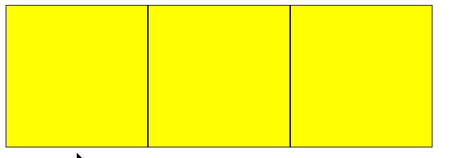
</html>这个基本上用的前端框架都包含了(eg:bootstrap),这边简单看下即可
<!DOCTYPE html>
<html>

<head>
    <meta charset="UTF-8">
    <meta name="viewport" content="width=device-width, initial-scale=1.0, user-scalable=no">
    <title>弹性</title>
    <style media="screen">
        ul {
            display: flex;
        }
        ul li {
            list-style: none;
            border: 1px solid black;
            background-color: yellow;
        }
        ul li:first-child {
            /* 权重为1 */
            flex: 1;
        }
        ul li:nth-child(2) {
            /* 权重为2 */
            flex: 2;
            /* 一般都配合min-宽高来使用 */
            min-width: 100px;
        }
        ul li:last-child {
            /* 权重为2 */
            flex: 2;
        }
    </style>
</head>
<body>
    <ul>
        <li>1</li>
        <li>2</li>
        <li>3</li>
    </ul>
</body>
</html>个人理解:规定一个最大或者最小的边界值,超过这个值就对指定元素设置指定样式
不难,看下demo里面的code片段就结束吧:
/* 屏幕小于等于1200px使用如下CSS(非宽屏) */
@media screen and (max-width: 1200px) {
  main {
    width: 95%;
  }

  /* 文章宽屏显示 */
  main article,
  .copyright {
    width: 100%;
  }

  /* 侧边栏隐藏 */
  main aside {
    display: none;
  }

  /* 页脚宽屏显示 */
  .copyright {
    width: 100%;
    min-width: auto;
  }
}
注意一下:响应式看起来加载的东西少了(eg:移动端)但其实和PC端请求页面大小一样(该加载的还是要加载,只是隐藏而已)
最后再提一下移动端的meta,一般都这么设置:宽度为屏幕宽度,且不允许用户缩放
<meta name="viewport" content="width=device-width, initial-scale=1.0, user-scalable=no">
Autoprefixer自动给添加不同浏览器CSS3前缀有些CSS3在谷歌浏览器、火狐、IE的老版本中可能不是标准名称,这时候可以通过Autoprefixer快速来兼容旧浏览器,之前写过文章,可以看看:
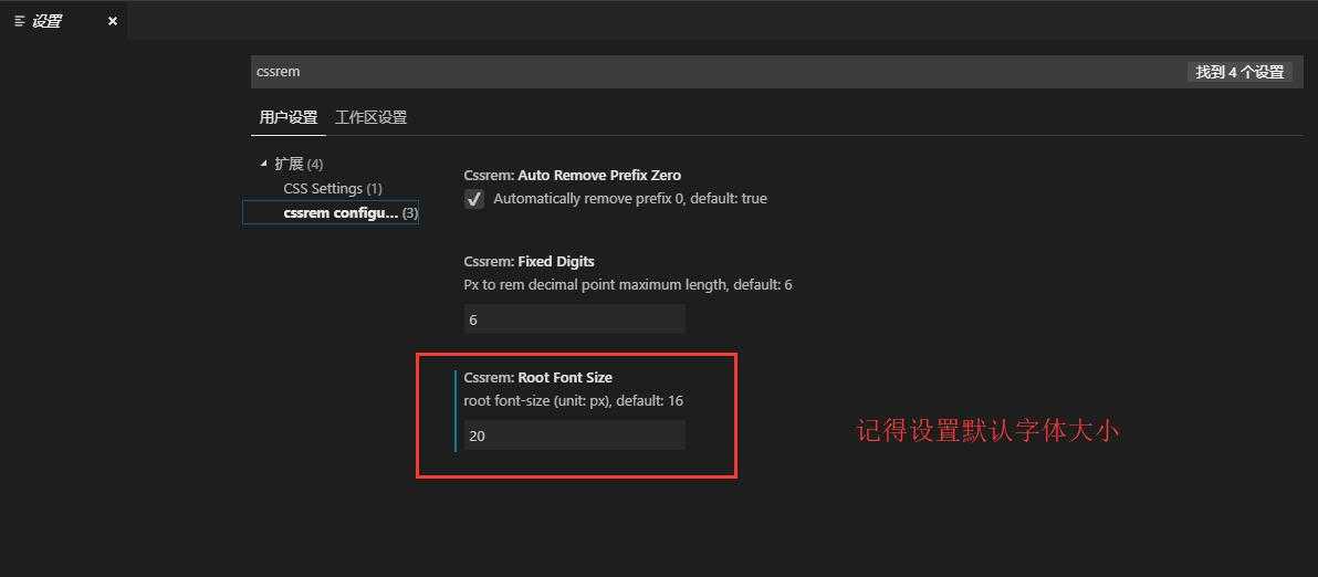
cssrem自动转换px到rem这个移动布局用的比较多,使用的时候有一点需要注意一下:需先设置默认root字体大小!(一般设置为20px)
PS:移动布局一般按照这个尺寸的双倍来设计:
其他的没什么好说的了,一切尽在代码中了~ https://github.com/lotapp/H5Blog/tree/master/mobil
(完)
原文:https://www.cnblogs.com/dotnetcrazy/p/10748103.html