HTML代码:

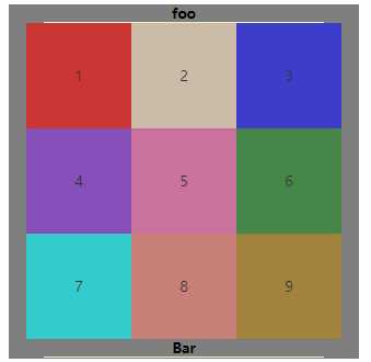
<!DOCTYPE html>
<html lang="en">
<head>
    <meta charset="UTF-8">
    <title>9x9方格布局</title>
    <link rel="stylesheet" href="style/9x9flex.css">
</head>
<body>
<div class="outer">
    <div class="item1"><h1>foo</h1></div>
    <div class="item2">
            <div class="colorBox" style="background-color: red">1</div>
            <div class="colorBox" style="background-color: bisque">2</div>
            <div class="colorBox" style="background-color: blue">3</div>
            <div class="colorBox" style="background-color: blueviolet">4</div>
            <div class="colorBox" style="background-color: hotpink">5</div>
            <div class="colorBox" style="background-color: forestgreen">6</div>
            <div class="colorBox" style="background-color: aqua">7</div>
            <div class="colorBox" style="background-color: salmon">8</div>
            <div class="colorBox" style="background-color: darkgoldenrod">9</div>
    </div>
    <div class="item3"><h1>Bar</h1></div>
</div>
</body>
</html>
css代码:
*{margin: 0;padding: 0}
.outer{
    width: 400px;
    height: 404px;
    background-color: grey;
    margin: 20px auto;
}
.item1,.item3{
    width: 80%;
    margin: 0 auto;
    height: 20px;
    border-bottom: 1px solid #f0f4c3;
}
.item1 h1,.item3 h1{
    font-size: 16px;
    text-align: center;
    line-height: 20px;
}
.outer .item2{
    display: flex;
    flex-wrap: wrap;
    justify-content: center;
    align-items: center;
}
.outer .item2 div{
    width: 120px;
    height: 120px;
    text-align: center;
    line-height: 120px;
    font-size: 16px;
    opacity: .6;
}
.item2 div:hover{
    opacity: 1;
    font-weight: 700;
    font-size: 24px;
}
HTML代码:
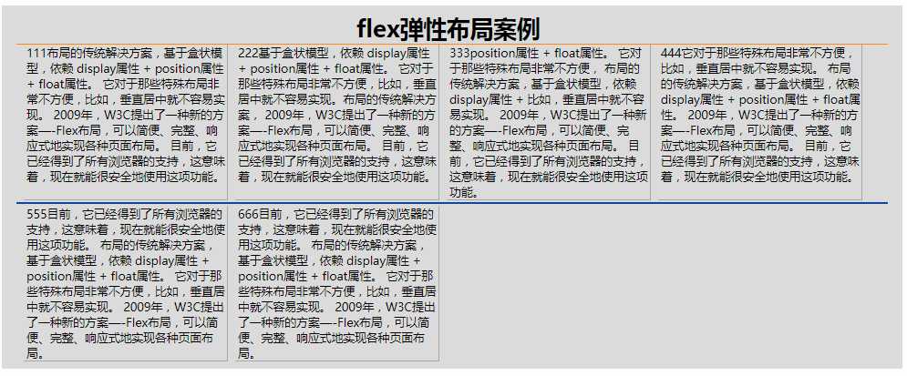
<!DOCTYPE html>
<html lang="en">
<head>
    <meta charset="UTF-8">
    <title>flex布局</title>
    <link rel="stylesheet" href="style/flex1.css">
</head>
<body>
    <div class="container">
        <div class="flex-title"><h1>flex弹性布局案例</h1></div>
        <div class="item one">
            <p>
                111布局的传统解决方案,基于盒状模型,依赖 display属性 + position属性 + float属性。
                它对于那些特殊布局非常不方便,比如,垂直居中就不容易实现。
                2009年,W3C提出了一种新的方案—-Flex布局,可以简便、完整、响应式地实现各种页面布局。
                目前,它已经得到了所有浏览器的支持,这意味着,现在就能很安全地使用这项功能。
            </p>
        </div>
        <div class="item two">
            <p>
                222基于盒状模型,依赖 display属性 + position属性 + float属性。
                它对于那些特殊布局非常不方便,比如,垂直居中就不容易实现。布局的传统解决方案,
                2009年,W3C提出了一种新的方案—-Flex布局,可以简便、完整、响应式地实现各种页面布局。
                目前,它已经得到了所有浏览器的支持,这意味着,现在就能很安全地使用这项功能。
            </p>
        </div>
        <div class="item three">
            <p>
                333position属性 + float属性。
                它对于那些特殊布局非常不方便,
                布局的传统解决方案,基于盒状模型,依赖 display属性 + 比如,垂直居中就不容易实现。
                2009年,W3C提出了一种新的方案—-Flex布局,可以简便、完整、响应式地实现各种页面布局。
                目前,它已经得到了所有浏览器的支持,这意味着,现在就能很安全地使用这项功能。
            </p>
        </div>
        <div class="item four">
            <p>
                444它对于那些特殊布局非常不方便,比如,垂直居中就不容易实现。
                布局的传统解决方案,基于盒状模型,依赖 display属性 + position属性 + float属性。
                2009年,W3C提出了一种新的方案—-Flex布局,可以简便、完整、响应式地实现各种页面布局。
                目前,它已经得到了所有浏览器的支持,这意味着,现在就能很安全地使用这项功能。
            </p>
        </div>
        <div class="hrhr"></div>
        <div class="item five">
            <p>
                555目前,它已经得到了所有浏览器的支持,这意味着,现在就能很安全地使用这项功能。
                布局的传统解决方案,基于盒状模型,依赖 display属性 + position属性 + float属性。
                它对于那些特殊布局非常不方便,比如,垂直居中就不容易实现。
                2009年,W3C提出了一种新的方案—-Flex布局,可以简便、完整、响应式地实现各种页面布局。

            </p>
        </div>
        <div class="item six">
            <p>
                666目前,它已经得到了所有浏览器的支持,这意味着,现在就能很安全地使用这项功能。
                布局的传统解决方案,基于盒状模型,依赖 display属性 + position属性 + float属性。
                它对于那些特殊布局非常不方便,比如,垂直居中就不容易实现。
                2009年,W3C提出了一种新的方案—-Flex布局,可以简便、完整、响应式地实现各种页面布局。

            </p>
        </div>
    </div>
</body>
</html>
css代码:
*{margin: 0;padding: 0}
.container {
    width: 70%;
    height: 80%;
    padding: 10px 20px 10px 20px;
    margin: 20px auto;
    background-color: gainsboro;
    display: flex;
    flex-wrap: wrap;
    justify-content: flex-start;
}
.container .flex-title{
    width: 100%;
    border-bottom: 1px solid darkorange;
}
.container .flex-title h1{
    margin: 0 39%;
}
.container .item {
    width: 23%;
    margin-left: 10px;
    padding-left: 4px;
    border-bottom: 1px solid darkgray;
    border-right: 1px solid darkgray
}
.container .hrhr{
    width: 100%;
    height: 2px;
    background-color: #0D47A1;
    margin: 3px auto;
}
.five,.six{width: 25%;justify-content: flex-start;}
原文:https://www.cnblogs.com/XJT2018/p/10645092.html
