<style>
  .container {
    width: 800px;
    height: 200px;
    display: flex;
    border: 1px solid black;
  }
  .flex {
    background: red;
    margin: 5px;
    flex: 1;
  }
</style>
<body>
  <div class="container">
    <div class="flex">
      flex
    </div>
  </div>
</body>
 这个是一整块占据了800像素,如果将子元素多加几块
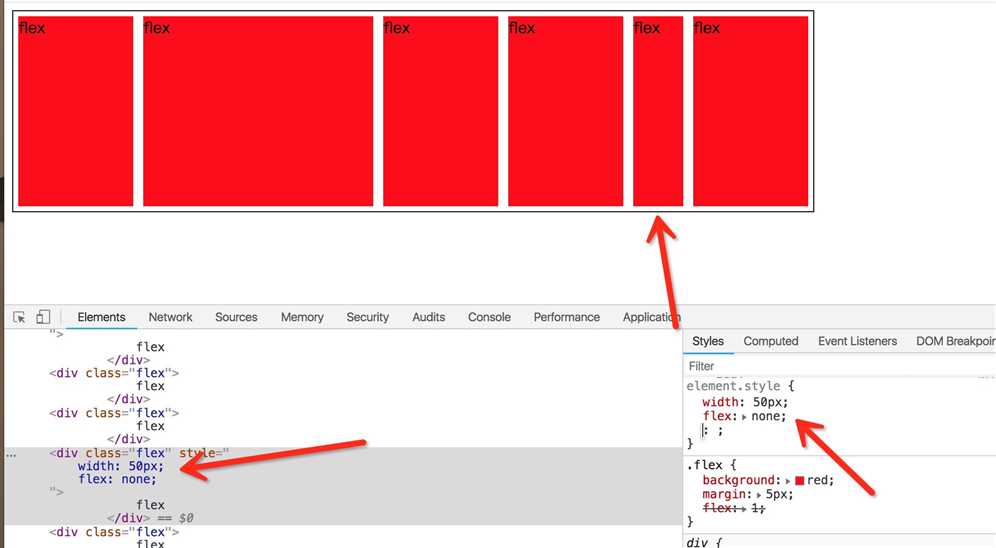
<div class="container">
  <div class="flex">
    flex
  </div>
  <div class="flex">
    flex
  </div>
  <div class="flex">
    flex
  </div>
  <div class="flex">
    flex
  </div>
  <div class="flex">
    flex
  </div>
  <div class="flex">
    flex
  </div>
</div>

会发现都被平分了有木有。

<style>
  .container {
    width: 800px;
    height: 200px;
    display: flex;
  }
  .left {
    background: red;
    width: 200px;
  }
  .right {
    background: blue;
    flex: 1;
  }
</style>
<body>
  <div class="container">
    <div class="left">
      左
    </div>
    <div class="right">
      右
    </div>
  </div>
</body>

<style media="screen">
  html *{
    padding: 0;
    margin: 0;
  }
  .layout article div{
    min-height: 100px;
  }
</style>
<body>
  <section class="layout flexbox">
    <style>
      .layout.flexbox .left-center-right{
        display: flex;
      }
      .layout.flexbox .left{
        width: 300px;
        background: red;
      }
      .layout.flexbox .center{
        flex: 1;
        background: yellow;
      }
      .layout.flexbox .right{
        width: 300px;
        background: blue;
      }
    </style>
    <article class="left-center-right">
      <div class="left"></div>
      <div class="center">
        <h2>flexbox</h2>
      </div>
      <div class="right"></div>
    </article>
  </section>
</body>

原文:https://www.cnblogs.com/wzndkj/p/10350567.html