1.GroupBox
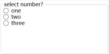
注意: GroupBox仍然需要布局容器来放置元素。如: StackPanel面板
 <GroupBox Header="select number?">
        <StackPanel>
            <RadioButton>one</RadioButton>
            <RadioButton>two</RadioButton>
            <RadioButton>three</RadioButton>
        </StackPanel>
    </GroupBox>
2.TabControl
像这种标签页控件, 在winform种非常常见, Tabpge子页面, 而在WPF种, 对应的则是TabItem类。
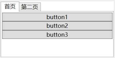
所示的代码示意图:
<TabControl>
        <TabItem Header="首页">
            <StackPanel>
                <Button>button1</Button>
                <Button>button2</Button>
                <Button>button3</Button>
            </StackPanel>
        </TabItem>

        <TabItem Header="第二页">
            <StackPanel>
                <Button>button4</Button>
                <Button>button5</Button>
                <Button>button6</Button>
            </StackPanel>
        </TabItem>

    </TabControl>
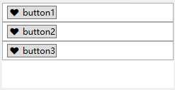
与Content属性相同, TabItem的Header同样可以接收任何类型的对象。这意味着可以创建一个组合框或选项卡。在他们的页标题中包含任意图形和任意元素。如下所示:
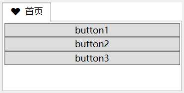
<TabControl>
        <TabItem >
            <TabItem.Header>
                <StackPanel Orientation="Horizontal">
                    <Button Background="Transparent" BorderBrush="Transparent">?</Button>
                    <TextBox BorderBrush="Transparent">首页</TextBox>
                </StackPanel>
            </TabItem.Header>

            <StackPanel>
                <Button>button1</Button>
                <Button>button2</Button>
                <Button>button3</Button>
            </StackPanel>

        </TabItem>
    </TabControl>
3.Expander菜单控件
具备标题的内容收缩控件, 在web中很普遍, 用于左侧菜单。
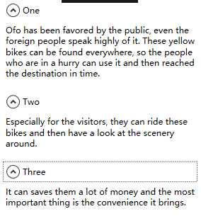
代码如下所示:
    <StackPanel>
        <Expander Header="One" Margin="5" Padding="5">
            <TextBlock TextWrapping="Wrap">Ofo has been favored by the public, even the foreign people speak highly of it. These yellow
                bikes can be found everywhere, so the people who are in a hurry can
                use it and then reached the destination in time.</TextBlock>
        </Expander>

        <Expander Header="Two" Margin="5" Padding="5">
            <TextBlock TextWrapping="Wrap">Especially for the visitors, they can ride these bikes and then have a look at the scenery around.</TextBlock>
        </Expander>

        <Expander Header="Three" Margin="5" Padding="5">
            <TextBlock TextWrapping="Wrap">It can saves them a lot of money and the most important thing is the convenience it brings.</TextBlock>
        </Expander>

    </StackPanel>
4.ListBox控件
ListBox控件是一个非常灵活的控件, 它不仅包含子元素ListBoxItem对象。而且也可以驻留其他元素, 这也就是ListBoxItem类继承于ContentControl类,从而ListBoxItem能够包含一段嵌套的内容。
例如, 创建一个包含普通按钮的列表。如下所示:
 <StackPanel>
        <ListBox>
            <ListBoxItem>
                <Button>? button1</Button>
            </ListBoxItem>
        </ListBox>

        <ListBox>
            <ListBoxItem>
                <Button>? button2</Button>
            </ListBoxItem>
        </ListBox>

        <ListBox>
            <ListBoxItem>
                <Button>? button3</Button>
            </ListBoxItem>
        </ListBox>
    </StackPanel>
5. ProgressBar进度条
IsIndeterminate属性设置为True, 控件则会周期性的显示一个绿色(默认)从左到右的脉冲。
    <Grid>
        <ProgressBar IsIndeterminate="True" Height="30"></ProgressBar>
    </Grid>
当然, 我们也可以通过修改Foreground 属性, 修改其滚动的颜色。如下所示
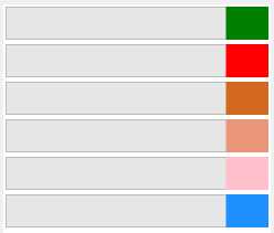
    <StackPanel>
        <ProgressBar Margin="2" IsIndeterminate="True" Height="30" Foreground="Green" ></ProgressBar>
        <ProgressBar Margin="2" IsIndeterminate="True" Height="30" Foreground="Red" ></ProgressBar>
        <ProgressBar Margin="2" IsIndeterminate="True" Height="30" Foreground="Chocolate" ></ProgressBar>
        <ProgressBar Margin="2" IsIndeterminate="True" Height="30" Foreground="DarkSalmon" ></ProgressBar>
        <ProgressBar Margin="2" IsIndeterminate="True" Height="30" Foreground="Pink" ></ProgressBar>
        <ProgressBar Margin="2" IsIndeterminate="True" Height="30" Foreground="DodgerBlue" ></ProgressBar>
    </StackPanel>
原文:https://www.cnblogs.com/zh7791/p/9014957.html