主要布局:
<!--盒子-->
<div class="box">
<!--内容-->
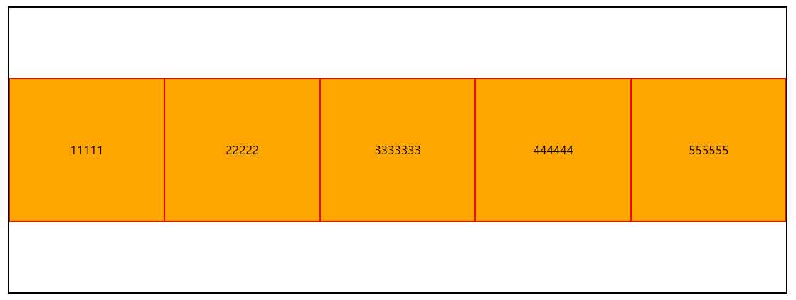
<div class="content">11111</div>
<div class="content">22222</div>
<div class="content center">3333333</div>
<div class="content">444444</div>
<div class="content">555555</div>
</div>
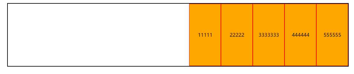
一、简单应用。
.box{
        width: 80%;
        margin: 6% auto;
        border: 2px solid black;
        display: flex;   /*弹性布局*/
}
.box .content{
        flex: 1;
        height: 200px;
        line-height: 200px;
        background-color: orange;
        border: 1px solid red;
        text-align: center;
}
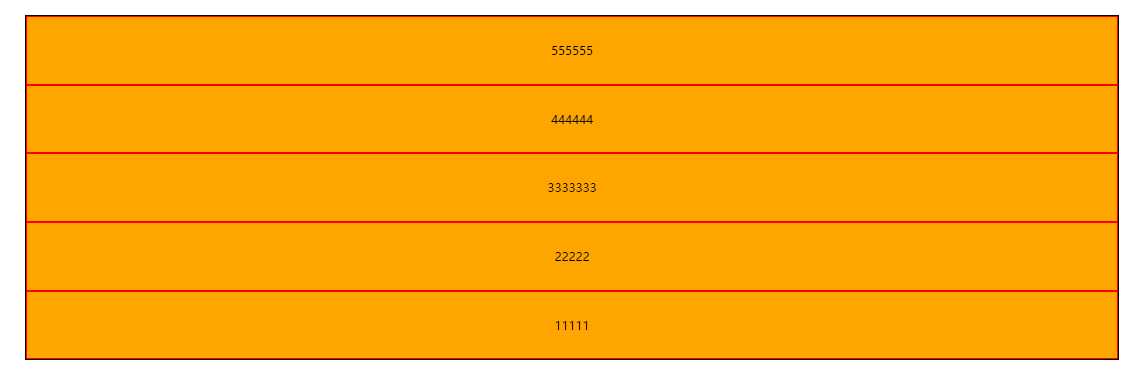
display: flex;  将盒子模型设置为弹性布局。
flex:1;         盒子中的每一块占 1等分即1/5等分。
效果图:
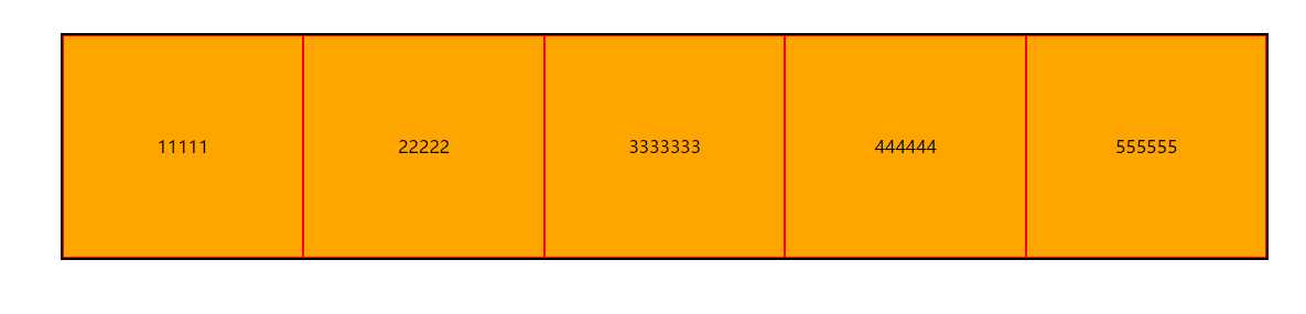
而且我们发现,当box 设置为flex布局时没有设置高度,而content设置了高度把box撑大了。
因此总结出弹性布局内的内容不会脱离文档流。
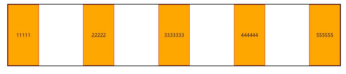
二、flex划分
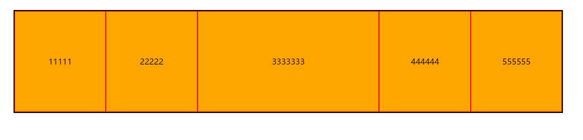
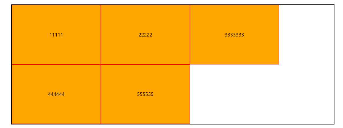
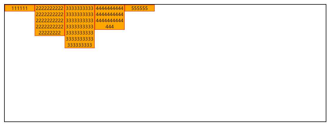
当我们添加以下内容时。(未添加时:由于.box .content{flex:1;}所以间接的.box .content.center{flex:1;})
.box .content.center{
	flex:2;      /*覆盖原先的flex:1*/
}
结果:
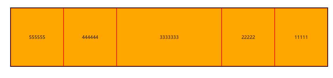
三、flex-direction属性控住。
该属性决定主轴的方向。内部值有:
row:默认值,主轴为横轴方向,起点在左端。
row-reverse:主轴为横轴方向,起点在右端。
.box{
        flex-direction: row-reverse;
}
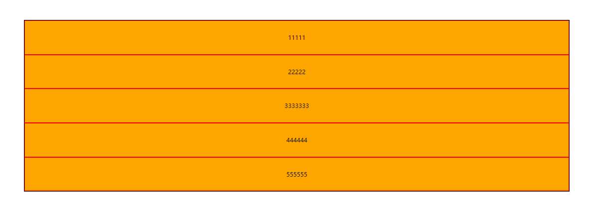
column:主轴为纵轴方向,起点在上方。
.box{
        flex-direction: column;
}
column-reverse:主轴为纵轴方向,起点在下方。
.box{
        flex-direction: column-reverse;
}
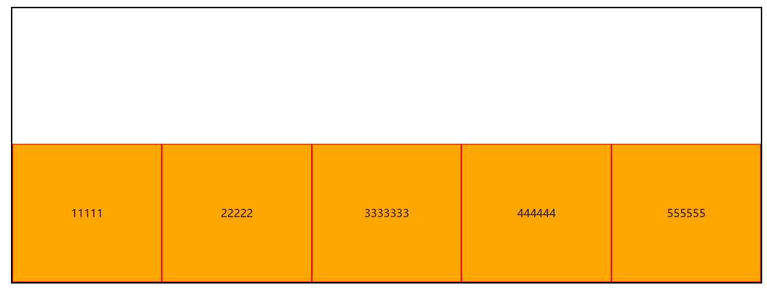
四、flex-warp控制换行。
首先content需要有自己的宽度(此处以下content都设置宽度),这样才能使用flex-warp。
flex-warp:nowarp; 默认。
flex-wrap: wrap; 装不下一行,则换行。
.box{
	width: 80%;
	margin: 6% auto;
	border: 2px solid black;
	display: flex;  	 /*弹性布局*/
	flex-wrap: wrap;
}
.box .content{
	width: 300px;
	height: 200px;
	line-height: 200px;
	background-color: orange;
	border: 1px solid red;
	text-align: center;
}
效果图:
flex-wrap: wrap-reverse;装不下一行,则换行,起点为左下脚。
目前为止,都没有用到过这种布局,感觉这种属性用处没多大。
五、justify-content项目之间的横轴布局(最常用属性实用性强)
功能:box盒子中content布局方式。(横向布局)
justify-content: flex-start;(默认值)
justify-content: center;
justify-content: flex-end;
justify-content: space-between;(大多数网站商品布局方式)
justify-content: space-around;
五、align-items纵向布局
由于此时需要观察纵向布局则设置:
.box{
        height: 400px;
}
.box .content{
        width: 300px;
}
align-items: stretch;(默认值)
align-content: flex-start;(向上靠齐,我感觉和默认stretch没什么区别)
align-content: flex-end;
align-items: center;
align-items: baseline;(项目的第一行文字的基线对齐)
当项目中的字符数不够的时候与align-items: stretch;没有区别。
因此修改body内容css内容注意,需要将content高度去除,让字符自动撑大。
.box{
width: 80%;
height: 400px;
margin: 6% auto;
border: 2px solid black;
display: flex; /*弹性布局*/
align-items: baseline;
}
.box .content{
width: 100px;
word-break: break-all;
background-color: orange;
border: 1px solid red;
text-align: center;
}
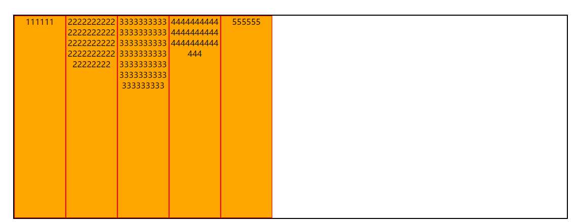
<div class="box">
<!--内容-->
<div class="content">111111</div>
<div class="content">222222222222222222222222222222222222222222222222</div>
<div class="content center">333333333333333333333333333333333333333333333333333333333333333333333</div>
<div class="content">444444444444444444444444444444444</div>
<div class="content">555555</div>
</div>
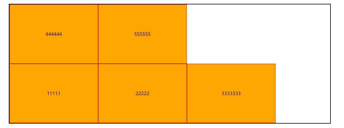
效果图:
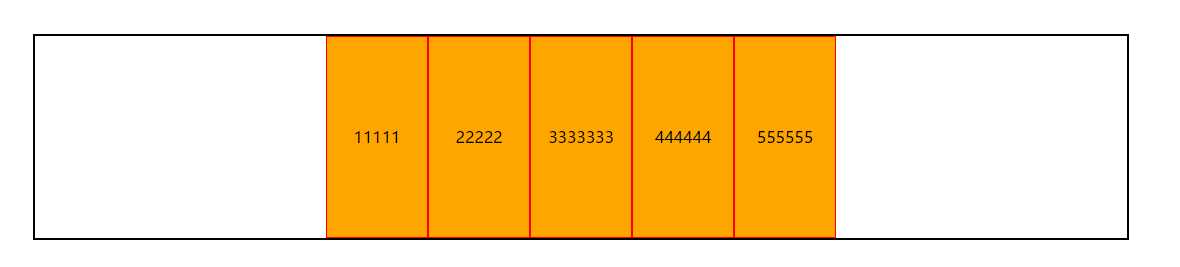
如果是默认值的话,效果图:
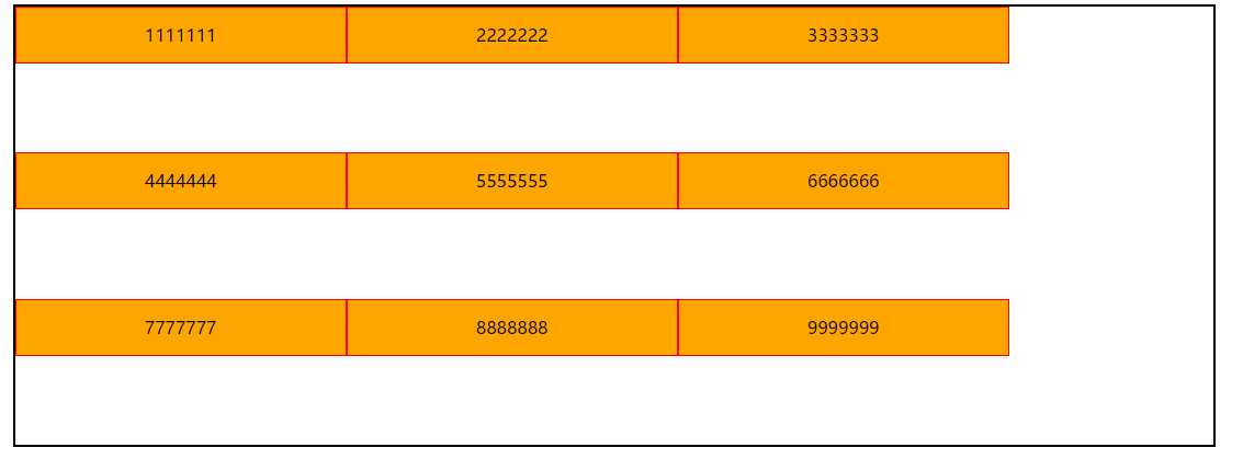
六、align-content相面之间的纵轴布局
(原理与justify-content相同只是方向不同。)
此时需要纵轴布局,因此需要改变body的内容和css的内容:
.box{
width: 80%;
height: 400px;
margin: 6% auto;
border: 2px solid black;
display: flex; /*弹性布局*/
flex-wrap: wrap; /*决定换行*/
align-content: stretch;
}
.box .content{
width: 300px;
height: 50px;
line-height: 50px;
background-color: orange;
border: 1px solid red;
text-align: center;
}
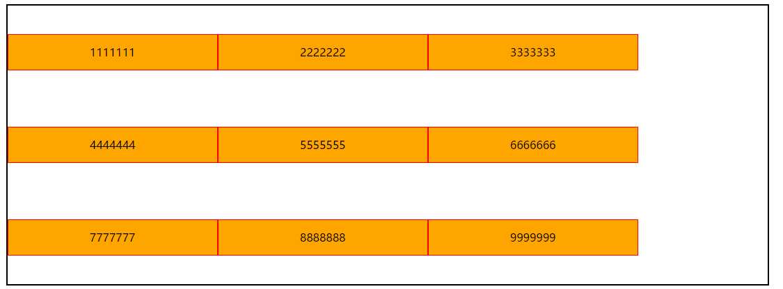
<!--盒子-->
<div class="box">
<!--内容-->
<div class="content">1111111</div>
<div class="content">2222222</div>
<div class="content">3333333</div>
<div class="content">4444444</div>
<div class="content">5555555</div>
<div class="content">6666666</div>
<div class="content">7777777</div>
<div class="content">8888888</div>
<div class="content">9999999</div>
</div>
align-content: stretch;(默认值)
align-content: flex-start;
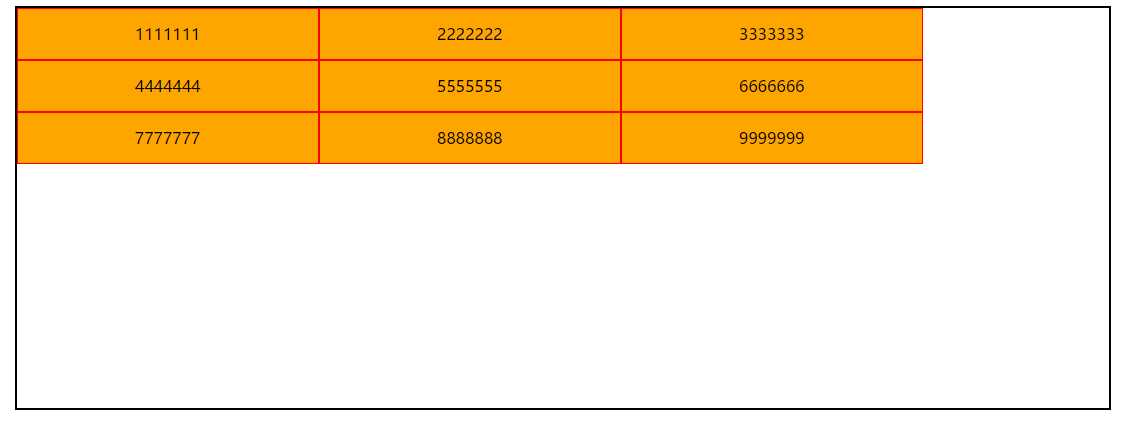
align-content: flex-end ;
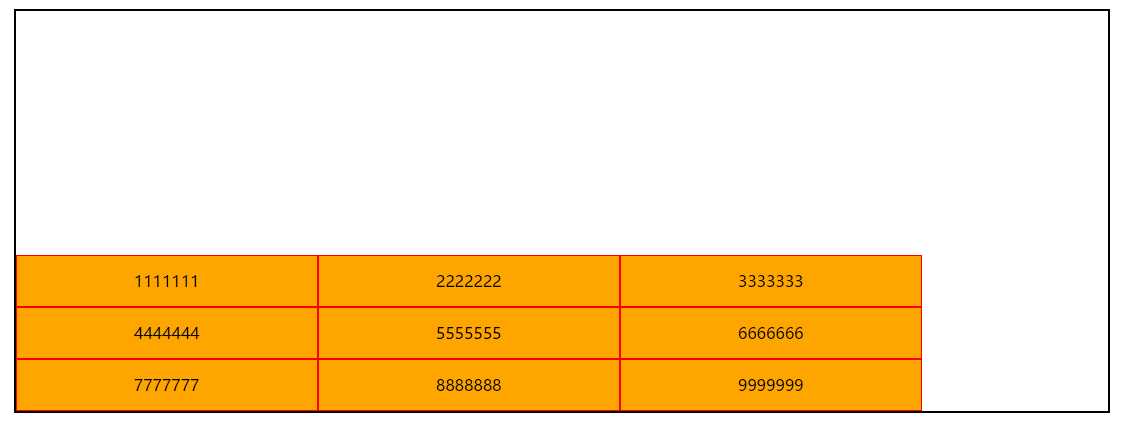
align-content: center ;
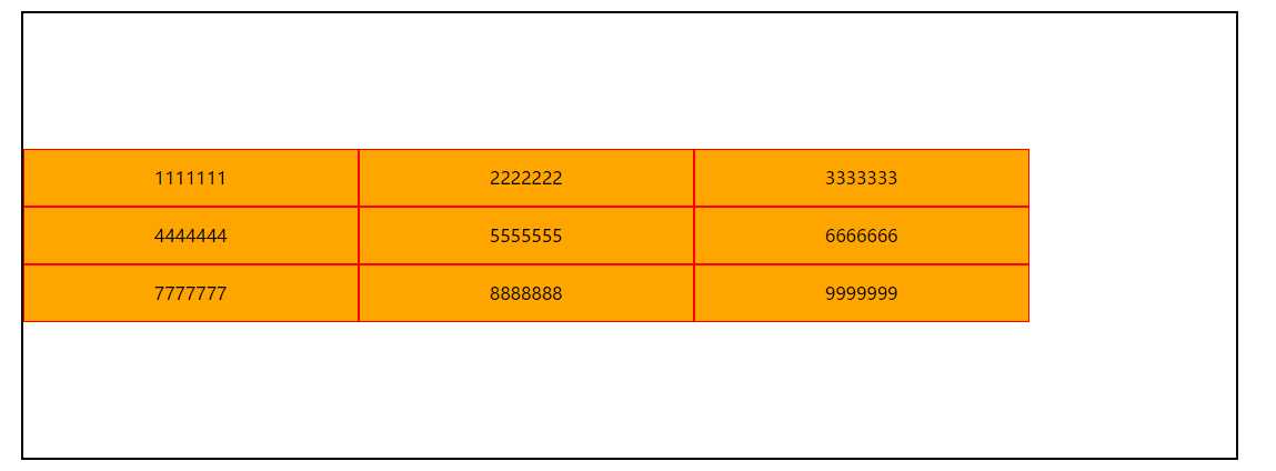
align-content: space-between ;
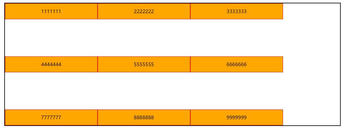
align-content: space-around ;
七、兼容性
| firefox | chrome | ie10+ |
| √ | √ | √ |
很多网上说flex支持 ie10 -ms-,但是经过测试ie10支持普通写法可以支持,不需要加-ms-。
(如有特殊情况,请可以提出!)
常用的基本都罗列出来了。
总得来说,flex弹性布局是非常实用的,熟练应用起来可以解决很多布局问题。
原文:http://www.cnblogs.com/cquptzy/p/7481569.html