一、左右栏宽度固定,中间栏宽度自适应
<!DOCTYPE html>
<html>
<head lang="en">
    <meta charset="UTF-8">
    <title>左右栏宽度固定,中间栏宽度自适应</title>
    <style>
        body{
            margin: 0;
            padding: 0;
            min-width:600px;
            color: #fff;
            font-weight: bold;
            font-size: 30px;
            text-align: center;
        }
        .main{
            width: 100%;
            float:left;
        }
        .content{
            margin:0 250px;
            background: #000;
            height: 200px;
        }
        .fl,.fr{
            float: left;
            width:240px;
            height:200px;
        }
        .fl{
            margin-left: -100%;
            background: red;
        }
        .fr{
            margin-left: -240px;
            background: green;
        }
    </style>
</head>
<body>
<div class="main">
    <div class="content">main</div>
</div>
<div class="fl">left</div>
<div class="fr">right</div>
</body>
</html>
<!doctype html>
<html lang="en">

	<head>
		<meta charset="UTF-8" />
		<title>Document</title>
		<style type="text/css">
		*{
			padding: 0px;
			margin: 0px;
		}
			#left {
				float: left;
				background-color: red;
				width: 150px;
				height: 50px;
			}

			#right {
				float: right;
				background-color: yellow;
				width: 200px;
				height: 50px;
			}

			#middle {
				margin: 0 200px 0 150px;
				width: 100%;
				background-color: #fff9ca;
				height: 50px;
			}
		</style>
	</head>

	<body>
		<div id="left"><span>left</span></div>
		<div id="right"><span>right</span></div>
		<div id="middle"><span>middle</span></div>
	</body>

</html>
今天想说的是一个左右定宽,中间自适应,实现三列布局,我也总结了以下,主要有以下几种:
废话不多说,直接上代码:

第一种:float

<!--html-->
<div id="left"><span>left</span></div>
<div id="right"><span>right</span></div>
<div id="middle"><span>middle</span></div>
//css
#left{
    float: left;
    background-color: red;
    width: 150px;
    height: 50px;
}
#right {
    float: right;
    background-color: yellow;
    width: 200px;
    height: 50px;
}
#middle {
    margin: 0 200px 0 150px;
    width: 100%;
    background-color: #fff9ca;
    height: 50px;
}
第二种:BFC

<!--html-->
<div id="left"><span>left</span></div>
<div id="right"><span>right</span></div>
<div id="middle"><span>middle</span></div>
//css
#left {
    background-color: red;
    width: 150px;
    height: 50px;
    float: left;
}
#right {
    background-color: yellow;
    width: 200px;
    height: 50px;
    float: right;
}
#middle {
    background-color: #fff9ca;
    height: 50px;
    overflow: hidden;
}
第三种:双飞翼布局

<!--html-->
<div class="grid">
    <div id="middle">
        <div id="middle-span"><span>middle</span></div>
    </div>
    <div id="left"><span>left</span></div>
    <div id="right"><span>right</span></div>
</div>
//css
#middle {
    float: left;
    background-color: #fff9ca;
    width: 100%;
    height: 50px;
}

#middle-span {
    margin: 0 200px 0 150px;
}

#left {
    float: left;
    position: relative;
    background-color: red;
    width: 150px;
    margin-left: -100%;
    height: 50px;

}

#right {
    float: left;
    position: relative;
    background-color: yellow;
    width: 200px;
    margin-left: -200px;
    height: 50px;
}
第四种:flex

<!--html-->
<div class="flex">
    <div id="left"><span>left</span></div>
    <div id="middle"><span>middle</span></div>
    <div id="right"><span>right</span></div>
</div>
//css
        .flex {
            display: flex;
            flex-flow: row;
        }

        #left {
            background-color: red;
            width: 150px;
            height: 50px;
        }

        #middle {
            background-color: #fff9ca;
            flex: 1; /* flex中宽度自适应使用该属性,使用100%时其他列的固定宽度会出现问题*/
            height: 50px;
        }

        #right {
            background-color: yellow;
            width: 200px;
            height: 50px;
        }

缩小窗口的效果:

二、除去列表右边框

<!DOCTYPE html>
<html>
<head lang="en">
    <meta charset="UTF-8">
    <title>除去列表右边框</title>
    <style>
        *{margin:0;padding: 0;}
        body{background: #000000}
        ul,li{list-style: none;}
        #content{
            width:630px;
            height:400px;
            background: #ccc;
            margin:30px auto;
        }
        #content ul{margin-right:-10px;}
        #content ul li{
            float: left;
            width:150px;
            height:195px;
            margin-right: 10px;
            margin-bottom: 10px;
            background: #e4004e;
            color:#fff;
            font-weight:bold;
        }
    </style>
</head>
<body>
<div id="content">
    <ul>
        <li>除去列表右边框</li>
        <li>除去列表右边框</li>
        <li>除去列表右边框</li>
        <li>除去列表右边框</li>
        <li>除去列表右边框</li>
        <li>除去列表右边框</li>
        <li>除去列表右边框</li>
        <li>除去列表右边框</li>
    </ul>
</div>

</body>
</html>
效果:

三、除去列表最后一个li的底边框(border-bottom)
容器有边框,容器中的列表也有底边框(border-bottom),导致最后一个li的border-bottom与容器的外边框重叠,分类列表中通常会遇到这个情况;
如图:

例:
<!DOCTYPE html>
<html>
<head lang="en">
    <meta charset="UTF-8">
    <title>除去列表最后一个li的底边框</title>
    <style>
        *{padding: 0;margin:0;}
        ul,li{list-style: none;}
        #category{
            margin:30px auto;
            width:350px;
            background: #eee;
            border: 1px solid #ccc;
            overflow: hidden;/*将超出的部分隐藏,最后一个li的border-bottom超出,被隐藏了;*/
        }
        #category li{
            width:100%;
            height:49px;
            line-height:49px;
            text-indent: 30px;
            border-bottom: 1px dashed #e4007e;
            margin-bottom: -1px;
        }
    </style>
</head>
<body>
<ul id="category">
    <li>女装 /内衣</li>
    <li>男装 /运动户外</li>
    <li>女鞋 /男鞋 /箱包</li>
    <li>化妆品 /个人护理</li>
    <li> 腕表 /珠宝饰品 /眼镜</li>
    <li>零食 /进口食品 /茶酒</li>
    <li>生鲜水果</li>
    <li>大家电 /生活电器</li>
</ul>
</body>
</html>
效果:

注意:当容器边框颜色和容器中列表边框的颜色不一样时,在容器元素上要添加overflow:hidden;将溢出部分隐藏起来;
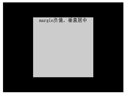
四、水平垂直居中
<!doctype html>
<html lang="en">

<head>
<meta charset="UTF-8" />
<title>Document</title>
<style type="text/css">
#box {
margin: 30px auto;
position: relative;
width: 400px;
height: 300px;
background: #000000;
text-align: center;
}

#box .main {
background: #ccc;
width: 200px;
height: 200px;
position: absolute;
top: 50%;
left: 50%;
margin-left: -100px;
margin-top: -100px;
}
</style>
</head>

<body>
<div id="box">
<div class="main">margin负值,垂直居中</div>
</div>
</body>

</html>
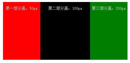
五、多列等高
给每个框设置大的底部内边距,然后再设置相同数值的负外边距来消除这个高度,致使每列都会溢出容器,对容器设置:overflow:hidden;多列框将在最高点裁切
<!doctype html>
<html lang="en">

	<head>
		<meta charset="UTF-8" />
		<title>Document</title>
		<style type="text/css">
			body,p {
				margin: 0;
				padding: 0;
			}

			#container {
				width: 500px;
				margin: 10px auto;
				overflow: hidden;
				position: relative;
			}

			#box1,
			#box2,
			#box3 {
				margin-bottom: -200px;
				padding-bottom: 200px;
			}

			#box1 {
				float: left;
				background: red;
				width: 150px
			}

			#box2 {
				float: left;
				background: #000;
				width: 200px
			}

			#box3 {
				float: left;
				background: green;
				width: 150px
			}

			p {
				color: #fff;
				text-align: center;
			}
		</style>
	</head>

	<body>
		<div id="container">
			<div id="box1">
				<p style="height:50px">
					第一部分高:50px
				</p>
			</div>
			<div id="box2">
				<p style="height:100px">
					第二部分高:100px
				</p>
			</div>
			<div id="box3">
				<p style="height:200px">
					第三部分高:200px
				</p>
			</div>
		</div>
	</body>

</html>
负margin在布局中的运用(*****************************************************************)
原文:http://www.cnblogs.com/libin-1/p/6087062.html