SpinKit 是一套网页动画效果,包含8种基于 CSS3 实现的很炫的加载动画。借助 CSS3 Animation 的强大功能来创建平滑,易于定制的动画。SpinKit 的目标不是提供一个每个浏览器都兼容的解决方案,而是给现代浏览器提供更优的技术实现方案和更佳的使用体验。(为保证最佳的效果,请在 Chrome、Firefox 和 Safari 等现代浏览器中浏览)
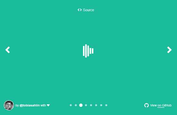
Loading 动画效果一
HTML 代码:
|
1
2
3
4
5
6
7
|
<div class="spinner"> <div class="rect1"></div> <div class="rect2"></div> <div class="rect3"></div> <div class="rect4"></div> <div class="rect5"></div></div> |
CSS 代码:
|
1
2
3
4
5
6
7
8
9
10
11
12
13
14
15
16
17
18
19
20
21
22
23
24
25
26
27
28
29
30
31
32
33
34
35
36
37
38
39
40
41
42
43
44
45
46
47
48
49
50
51
52
|
.spinner { margin: 100px auto; width: 50px; height: 60px; text-align: center; font-size: 10px;}.spinner > div { background-color: #67CF22; height: 100%; width: 6px; display: inline-block; -webkit-animation: stretchdelay 1.2s infinite ease-in-out; animation: stretchdelay 1.2s infinite ease-in-out;}.spinner .rect2 { -webkit-animation-delay: -1.1s; animation-delay: -1.1s;}.spinner .rect3 { -webkit-animation-delay: -1.0s; animation-delay: -1.0s;}.spinner .rect4 { -webkit-animation-delay: -0.9s; animation-delay: -0.9s;}.spinner .rect5 { -webkit-animation-delay: -0.8s; animation-delay: -0.8s;}@-webkit-keyframes stretchdelay { 0%, 40%, 100% { -webkit-transform: scaleY(0.4) } 20% { -webkit-transform: scaleY(1.0) }}@keyframes stretchdelay { 0%, 40%, 100% { transform: scaleY(0.4); -webkit-transform: scaleY(0.4); } 20% { transform: scaleY(1.0); -webkit-transform: scaleY(1.0); }} |
Loading 动画效果二
HTML 代码:
|
1
|
<div class="spinner"></div> |
CSS 代码:
|
1
2
3
4
5
6
7
8
9
10
11
12
13
14
15
16
17
18
19
20
21
22
23
24
25
26
27
28
|
.spinner { width: 60px; height: 60px; background-color: #67CF22; margin: 100px auto; -webkit-animation: rotateplane 1.2s infinite ease-in-out; animation: rotateplane 1.2s infinite ease-in-out;}@-webkit-keyframes rotateplane { 0% { -webkit-transform: perspective(120px) } 50% { -webkit-transform: perspective(120px) rotateY(180deg) } 100% { -webkit-transform: perspective(120px) rotateY(180deg) rotateX(180deg) }}@keyframes rotateplane { 0% { transform: perspective(120px) rotateX(0deg) rotateY(0deg); -webkit-transform: perspective(120px) rotateX(0deg) rotateY(0deg) } 50% { transform: perspective(120px) rotateX(-180.1deg) rotateY(0deg); -webkit-transform: perspective(120px) rotateX(-180.1deg) rotateY(0deg) } 100% { transform: perspective(120px) rotateX(-180deg) rotateY(-179.9deg); -webkit-transform: perspective(120px) rotateX(-180deg) rotateY(-179.9deg); }} |
Loading 动画效果三
HTML 代码:
|
1
2
3
4
|
<div class="spinner"> <div class="double-bounce1"></div> <div class="double-bounce2"></div></div> |
CSS 代码:
|
1
2
3
4
5
6
7
8
9
10
11
12
13
14
15
16
17
18
19
20
21
22
23
24
25
26
27
28
29
30
31
32
33
34
35
36
37
38
39
40
41
|
.spinner { width: 60px; height: 60px; position: relative; margin: 100px auto;}.double-bounce1, .double-bounce2 { width: 100%; height: 100%; border-radius: 50%; background-color: #67CF22; opacity: 0.6; position: absolute; top: 0; left: 0; -webkit-animation: bounce 2.0s infinite ease-in-out; animation: bounce 2.0s infinite ease-in-out;}.double-bounce2 { -webkit-animation-delay: -1.0s; animation-delay: -1.0s;}@-webkit-keyframes bounce { 0%, 100% { -webkit-transform: scale(0.0) } 50% { -webkit-transform: scale(1.0) }}@keyframes bounce { 0%, 100% { transform: scale(0.0); -webkit-transform: scale(0.0); } 50% { transform: scale(1.0); -webkit-transform: scale(1.0); }} |
Loading 动画效果四
HTML 代码:
CSS 代码:
Loading 动画效果五
HTML 代码:
CSS 代码:
Loading 动画效果六
HTML 代码:
CSS 代码:
Loading 动画效果七
HTML 代码:
CSS 代码:
Loading 动画效果八
HTML 代码:
CSS 代码:
原文:http://www.cnblogs.com/huaxingtianxia/p/5969243.html