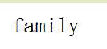
效果图:
代码:
<!DOCTYPE html PUBLIC "-//W3C//DTD XHTML 1.0 Strict//EN" "http://www.w3.org/TR/xhtml1/DTD/xhtml1-strict.dtd">
<html xmlns="http://www.w3.org/1999/xhtml">
<head>
<meta http-equiv="Content-Type" content="text/html; charset=utf-8" />
<title>无标题文档</title>
<style>
a {
    position: relative;
    display: inline-block;
    outline: none;
    text-decoration: none;
    color: #000;
    font-size: 32px;
    padding: 5px 10px;
}

a:hover::before, a:hover::after { position: absolute; }
a:hover::before { content: "\5B"; left: -10px; }
a:hover::after { content: "\5D"; right:  -10px; }
</style>
</head>

<body>
<a>family</a>
</body>
</html>
原文:http://www.cnblogs.com/luoluo8/p/5880670.html