一.设置3D场景
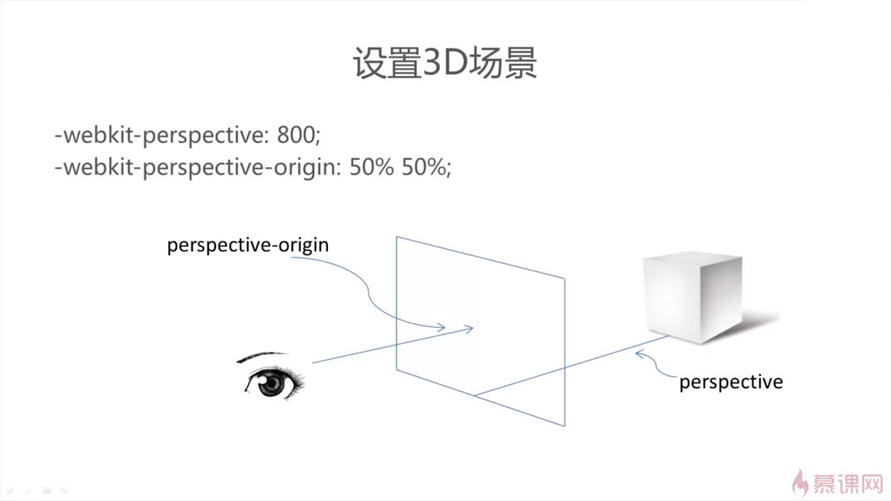
perspective:800 //浏览器到物体的距离(像素)
perspective-origin:50% (x轴) 50% (y轴) //视点的位置
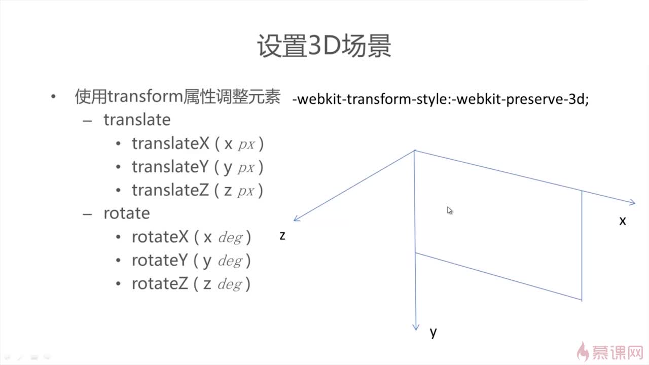
transform-style: preserve-3d;
示例:
<!DOCTYPE html>
<html lang="en">
<head>
	<meta charset="UTF-8">
	<title></title>
	<style type="text/css">
	#experiment{
		 -webkit-perspective: 800;
		 -webkit-perspective-origin: 50% 50%;
		 -webkit-transform-style: -webkit-preserve-3d;
	}
	.block{
		width:500px;
		height:500px;
		text-align:center;
		line-height:450px;/*牢记居中用行高 */
		font-size:100px;
		background-color:burlywood;
		margin:100px auto;
		transform:rotatex(45deg);
		/*transform:rotatey(45deg);
		transform:rotatez(45deg);*/
	}
	</style>
</head>
<body>
	<div id="experiment">
		<div class="block">css3</div>
	</div>
</body>
</html>
原文:http://www.cnblogs.com/jerry666/p/5289331.html