0)float,position,z-index
1)display:block,inline,inline-block,none;
2)盒模型相关属性
3)background:color url(../images/xx.jpg) repeat attachment position (size clip origin)
4)字体属性font(family,size,weight,style),text(align,transform,indent),word(letter)-spacing word-break,word-wrap
5)CSS3 border-radius(圆角边框),opacity,text-shadow(文本阴影),box-shadow(盒阴影),linear-gradient(线性渐变),background-size(clip,origin)图像的尺寸,trasition,tranfrom,animation
1. 标签选择器
h1{color:red;}
h3,h4,p{font-size:12px;}  多个用 " , " 隔开
2. 类选择器
.main{color:red;}
3. 后代选择器
.main h3{color:red;}
4. 子选择器
.main > h3{color:red;}  子选择器 不是孙级

<div class="main">
    <h3>h3标题</h3>  这个h3会显示红色
    <div>
         <h3>h3标题2</h3>  他不会显示红色
    </div>
</div>
5. 兄弟选择器
.main ~ h3{color:red;}  中间可以隔元素

<div class="main"></div>
<a href="javascript:;">元素</a>
<h3>兄弟1</h3>
<h3>兄弟2</h3>
6. 相邻选择器
.main + h3{color: #f60;}    中间不可以隔元素,可以有文字,应用下面的一个元素

<div class="main"></div>
打快点撒
<h3>兄弟1</h3>
<h3>兄弟2</h3>
7. 属性选择器
input[type="text"]{color:red;}

<form>
    <input type="text">
</form>
7.1 [title]{带有title属性的所有元素}
7.2 [class="title"]{class属性值为title的元素}
7.3 [class^=main]{class属性值以main开头的元素}
7.4 [class$=main]{class属性值以main结尾的元素}
7.5 [class*=main]{class属性值包含mian字符的元素}
7.6 [class~=main]{class属性值用 ‘空格’ 隔开的元素}
7.7 [class|=main]{class属性值用 ‘-’ 隔开的元素}
伪类
:hover , :link , :active , :visited  , :focus , :blur{}   动态伪类
:disabled(不可编辑的), :enabled , :read-only(只读), :read-write , :focus    UI伪类
CSS3伪类
:nth-child(选择器匹配属于其父元素的第 N 个子元素,不论元素的类型) , :nth-last-child(n) , :first-child , :last-child
:nth-of-type(选取父元素的第 N 个指定类型的子元素) , :nth-last-of-type(n) , :last-of-type , :last-of-type
:not(h3) 否定伪类 不是h3
伪元素
::before , ::after , ::first-letter(第一个字符), :first-line(第一段), ::selection(选取到文字时)
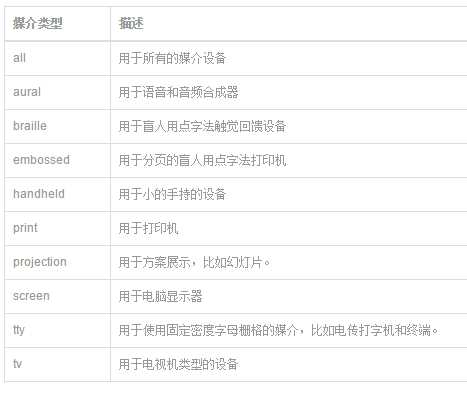
media query能够获取哪些值?
设备的宽和高device-width,device-heigth显示屏幕/触觉设备。
渲染窗口的宽和高width,heigth显示屏幕/触觉设备。
设备的手持方向,横向还是竖向orientation(portrait|lanscape)和打印机等。
画面比例aspect-ratio点阵打印机等。
设备比例device-aspect-ratio-点阵打印机等。
对象颜色或颜色列表color,color-index显示屏幕。
设备的分辨率resolution。

语法结构及用法
@media 设备名 only (选取条件) not (选取条件) and(设备选取条件),设备二{sRules}
示例一:在link中使用@media:
<link rel=“stylesheet” type=“text/css” media=“only screen and (max-width: 480px),only screen and (max-device-width: 480px)” href=“link.css”/>
上面使用中only可省略,限定于计算机显示器,第一个条件max-width是指渲染界面最大宽度,第二个条件max-device-width是指设备最大宽度。

示例二:在样式表中内嵌@media:
@media (min-device-width:1024px) and (max-width:989px),screen and (max-device-width:480px),(max-device-width:480px) and (orientation:landscape),(min-device-width:480px) and (max-device-width:1024px) and (orientation:portrait) {srules}
伪类
原文:http://www.cnblogs.com/relstart/p/4887064.html