效果图: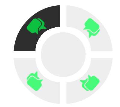
主要实现过程:
1)4个Li元素,把他们的定位都设置未absolute.
2)改变li的旋转中心到右下角 transform-origin: 100% 100%; 4个对应旋转的角度为0,90,180,270deg
3)定位第五个li在中心
4)前面的4个li都往其所在角偏移10PX,以显示间隙
5)4个li里面的a标签设置渐变的背景色,让圆心位置的颜色设置为隐藏 background: -webkit-radial-gradient(right bottom, transparent 35%, #eee 35%);
源码:
<div class="nav">
    <ul>
        <li><a href=""><span class="icon"></span></a></li>
        <li><a href=""><span class="icon"></span></a></li>
        <li><a href=""><span class="icon"></span></a></li>
        <li><a href=""><span class="icon"></span></a></li>
        <li><a href=""></a></li>
    </ul>
</div>
.nav {
    width: 300px;
    height: 300px;
    /*border:1px solid blue;*/
    position: fixed;
    top: 10%;
    left: 30%;
    border-radius: 50%;
    overflow: hidden;
}

.nav li {
    position: absolute;
    width: 150px;
    height: 150px;
    transform-origin: 100% 100%;
}

.nav li a:hover {
    background: -webkit-radial-gradient(right bottom, transparent 35%, #2e2e2e 35%);
}

.nav li a {
    display: block;
    position: absolute;
    width: 150px;
    height: 150px;
    background: -webkit-radial-gradient(right bottom, transparent 35%, #eee 35%);
}

.nav li:nth-child(1) {
    transform: rotate(0deg);
    left: -10px;
    top: -10px;
}

.nav li:nth-child(2) {
    transform: rotate(90deg);
    left: 10px;
    top: -10px;
}

.nav li:nth-child(3) {
    transform: rotate(180deg);
    top: 10px;
    left: 10px;
}

.nav li:nth-child(4) {
    transform: rotate(270deg);
    top: 10px;
    left: -10px;
}

.nav li:nth-child(5) {
    border-radius: 100%;
    transform: scale(0.9);
    left: 27.5%;
    top: 27.5%;
    transform-origin: 0 0;
    background: #eee
}

.nav li:nth-child(5) a {
    background: #eee;
    border-radius: 100%;
}

.nav li:nth-child(5) a:hover {
    background: #2e2e2e;
    border-radius: 100%;
}

.icon {
    opacity: 0.7;
    display: inline-block;
    width: 80px;
    height: 70px;
    text-align: center;
    font-size: 30px;
    background: url(../img/mes.png);
    transform: rotate(-50deg) translate(-5%, 83%);
}
原文:http://www.cnblogs.com/sakura-Master/p/4775169.html